Chapter 16
Design and Colour is a monstrous topic. I'm certainly not going to cover it all in this section, but that's not the intention. This book is about the basics of graphic design as it applies to the web and, as such, I'm going to take what I feel is useful in colour theory and just present and explain that. Colour theory can be complicated because, over time, it has come to represent three areas of study: scientific, artistic and psychological.
Within this chapter, I'm just going to talk about one area – artistic – and touch on another, psychological. I'm not going to be discussing the science of colour and how that applies to things like accessibility on the web; whole books have been written on that subject alone. Designing with colour is perhaps the element of graphic design which is the most difficult to get right. Why? Because it is the most subjective. For some, a palette of dark grey with splashes of bright pink will be just great; to others it would just be all wrong. Too many designers, whether schooled in colour theory or not, end up making subjective decisions about colour and then when it comes to explaining those decisions to a client, things begin to unravel.
This chapter will help you move beyond the subjective and provide you with the foundation you need to make objective decisions. It's about getting to grips with simple colour theory, creating effective colour combinations and making sure you don't offend a traditional Chinese wedding company by designing their website in predominantly white (which is associated with funerals, by the way).
The Colour Wheel
Colour theory involves a great deal of complex terminology.
Colour theory involves a great deal of complex terminology; in this chapter, I'll outline some of the basics.
At its heart, colour theory is concerned with the creation of colour combinations via relationships. The relationships are created by the position of the colours on the colour wheel. The complexity of colour theory really kicks in when you start taking into account different hues, shades and tones. It can all get a bit too much. So here, I'm keeping things very simple and I'm starting at the beginning with primary colours.
Primary Colours
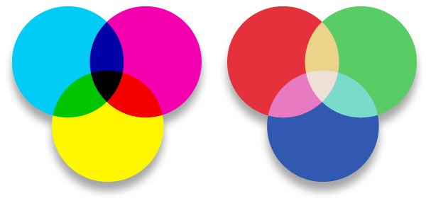
Primary colours can be divided into two different types: additive and subtractive. The additive primaries are those which are obtained by light: red, green and blue. They combine to form white and form the basis of colours on screen, (your TV works in RGB, as does your computer screen). Subtractive primaries are those obtained by the subtraction of light: cyan, magenta and yellow. They form the basis of 'four colour' printing and combine to form black, the K in CMYK.
left: Subtractive colours combine to form black.
right: Additive colours reduce to produce white.
The Colour Wheel
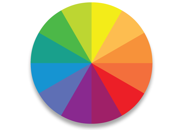
The colour wheel not only helps understand the relationship of different colours but also the classification of colours. It also, as I said, provides a quick reference to the primary, secondary and tertiary hues.
Primary, secondary and tertiary colours
The primary, secondary and tertiary hues are shown in the diagram below. As you can see, it's pretty straight–forward to see how each is produced; primary colours combined create secondary colours. Tertiary colours are created by combining a Primary and a Secondary. Things start to get interesting when you isolate different combinations of colours and this is when we get into the realms of colour wheel selections.
Colour Wheel selections

Colours, when selected from the colour wheel in certain combinations, interact together. This is the basis of colour palettes; the interaction of colours. Knowing the basis of these colour combination types is essential in creating palettes. True, you can rely on gut instinct, (as many designers do), but more often than not these decisions are based on experience of seeing these colour combinations everywhere in everyday life. Really, once you start to notice these different combinations, it will drive you bonkers.
Monochrome
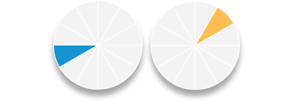
Monochrome selections are simply one colour from the colour wheel.
Complementary
Complementary selections are based on contrasting colours. Sometimes they look horrible and simply do not work. However, sometimes they are just the ticket. I generally use them if I want a vibrancy in a palette, or if I need to draw the readers eye to something. Hues of these colours work great as a highlight colour. They are defined by the colours opposing each other on the colour wheel.
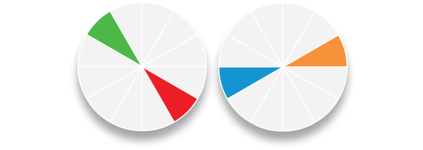
Triads
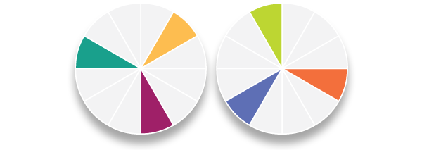
Triads are really interesting. They provide tension, which can be important in some designs, because their strength is relatively equal. Triad colours are any three colours which are equidistant on the colour wheel. As all three colours contrast with one another they can clash and this is where the tension is created.
Other Colour Wheel selections
There are other selections which can be used to form palettes: Analogous, Mutual complements, near complements and double complements.
“Colours, when selected from from the colourwheel in certain combinations, interact together. This is the basis of colour palettes; the interaction of colours.”
Analogous colours, for example, are those which sit immediately adjacent on either side of a selected colour on the wheel. However, I find that I rarely use these four types of colour wheel selections consciously. Designers are more likely to choose these selections unconsciously, as they appear around us naturally.
More from this part
- Chapter 16 – The Colour Wheel
- Chapter 17 – Hue, Saturation and Brightness
- Chapter 18 – Colour combinations and mood
- Chapter 19 – Designing without colour
- Chapter 20 – Colour and Brand
Download the book
Download your FREE copy of Designing for the Web.