Chapter 18
Colour combinations and mood
Colours chosen from different spokes on the Colour Wheel will provide a variety of colour combinations.
Colours chosen from different spokes on the Colour Wheel will provide a variety of colour combinations. Deciding upon and selecting a colour combination that works will very much depend upon the job at hand.
Will it communicate what you want it to? Or, are you just choosing it because you, or the client, like it? These are difficult questions to answer because any designer or client will let their personal style and preference interfere with their decision–making. Colour combinations tend to evoke certain reactions, based on cultural or personal experience. Understanding these experiences will help you create colour combinations that tell a story. That is what good colour theory can give you: designs that tell a story. I'm going to go over a few combinations here to demonstrate my thinking, but before I get onto that, it's worth noting how palettes can be presented to potential clients or in design documentation.
Presenting Combinations and Palettes
I've always presented palettes in two different ways depending on the amount of colours. In a broad palette, with many colours, I display these left to right with dominance and usage being denoted by the size of the square, or block, of colour. For smaller palettes and combinations, I use the rectangle containing a line and a square. I was taught this simple device in university but it is similar to many other examples I've seen. You can use circles, blobs, lines, squares. It's up to you. The important thing is to indicate the relative weight of colour. I was tempted to call this combination a Triad. However, if you think back to the Colour Wheel, this is not the case. In colour theory, “triads” aren't just any combination of three colours. Triads are based on colours which are equidistant on the Colour Wheel.
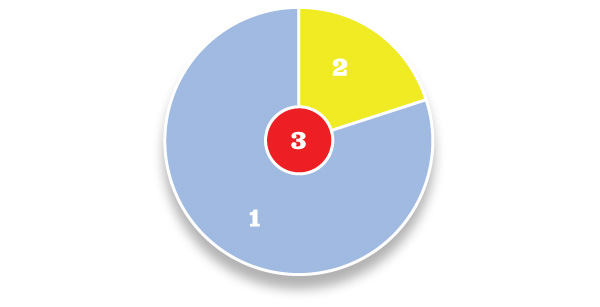
- Subordinate, or base colour. This is a visually weak or subordinate colour. It should contrast or complement.
- Dominant or main colour. This colour defines the communicative values of the combination.
- Accent or highlight colour. The accent colour can be sympathetic to the subordinate or dominant colour. Or, instead, you may choose an accent colour that is visually strong and striking, and appears to compete with the dominant colour. This can provide tension within a combination.
Accent or highlight colour. The accent colour can be sympathetic to the subordinate or dominant colour. Or, instead, you may choose an accent colour that is visually strong and striking, and appears to compete with the dominant colour. This can provide tension within a combination.
Examples of Colour Combinations
Active / Vibrant
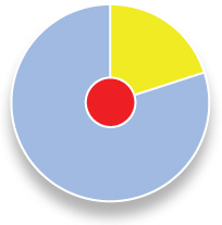
Active combinations are intense. They feature bright, often complementary, colours on the colour wheel and are combinations of primary, secondary and tertiary colours. To many people, colour combinations such as this evoke feelings of noise, flamboyance and energy. It's a young combination, (although not in all cultures), aimed at young adults. Usually these colors aren't the ones I describe as ‘natural’ on the next page, although they may be more intense tones of those same colours – and therefore, useful for 'natural' applications, such as the travel industry.
Muted / Calm
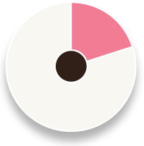
Muted palettes have a lot of white in the hues. This example uses blues and introduces lavender as the dominant colour. The resultant colourway, (or combination), is balanced and calming. Hues in the blue, green and violet areas of the colour wheel convey a visual quietness. The accent is almost always used as sympathetic to the dominant. Often used in the cosmetics industry, the visual softness of the colours usually portrays a feminine quality.
Pastel
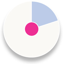
A pastel combination is similar to the muted combination, in that it is often based on colours containing a lot of white, (or lack of white, if you are using the subtractive CMYK colour model used in print work). Where they differ is that pastel combinations combine warm and cool tones readily. This combination can portray youth and innocence, (babies!), and has a warmth that the muted combination fails to deliver.
Natural
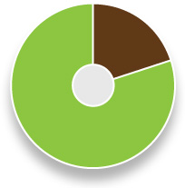
Natural combinations are those colours that are borrowed from the great outdoors. Rusty reds, browns, sky blues and warm pinks are the order of the day. I find the easiest way to create these combinations is to go outside, take a photograph and then choose some colours from that; you really can create some stunning combinations. When you need to communicate rustic charm or the feeling of walking through autumn leaves, then this is the type of combination you're after.
Rich
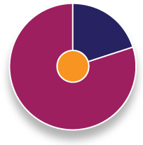
This is a good one: hues of royalty, tradition, (often religious), and, above all, wealth. Rich colour combinations are the combinations which are so engrained in culture. True, the actual colours used may differ, but the overall effect is seen throughout the world. Maroon is often mixed with gold and strong shades of green. For a fuller palette, add colours from the natural combination described earlier.
Part of the Design Solution
I hope I've conveyed what an important role colour plays in the design solution. By selecting the best combination of colours, you can go a long way toward ensuring the success of your design. We've looked at some colour combinations here, but what about the individual colours? They communicate their own meanings and make a significant impact on the mood and tone of a given design. Next, I'll move on to discussing colour and mood. What do individual colours mean?
Moody Stories
Colours can tell a story in a very effective way because they create an emotional reaction from the reader. These reactions can form the basis of how a design is perceived. So, if a design uses a lot of red and orange, it could be described as ‘angry’, ‘hot’, ‘wealth’, ‘divine’ or ‘pure’. The latter two in this list account for cultural differences in interpretation of the colour red. In the same way, a design which is comprised of a predominantly blue colour combination could be described as 'cold', 'calm' or 'reserved'.
Designers must be sensitive to the cultural aspects of the meaning and symbolism of colours. Let's take the example I've just used of red. In the West, red is seen as a hot colour. It's vibrant, flashy, and angry. In fact, a common saying is ‘seeing red’, or ‘the red mist descends’, indicating anger or fury. However, in the East, red is seen as a colour associated with wealth, purity and good fortune and sometimes divinity. Another great example is black and white. In the West, black can be associated with death and mourning. The opposite is sometimes the case in the East; white is the colour of mourning.
Choosing colours should therefore not only be an exercise in finding the right balance and aesthetic combination of colours, but also an exercise in studying the target audience's cultural norms. The consequences of getting it wrong could be disastrous.
Colours that aren't colours
Black
In looking at the connection between colour and mood, we begin with a colour that isn't really a colour. Black is the absence of colour. In the West, it's associated with death and mourning, but also has an authoratitive, official feel. It can sometimes be used in branding to give a sense of style; a classy touch. In this sense, black can suggest wealth and oppulance. Black should be used sparingly, though, especially on the web, due to its value of perceived weight. A user will always think a black web page loads quicker than a white one.
White
White, too, isn't a colour. Again, there are cultural differences. In the East, white is associated with funerals, death and mourning. In the West, the opposite is the case, where white is associated with simplicity, purity and goodness. We see white everywhere in branding, businesses and buildings where we want to feel calm. White is perhaps the most important component of most colour palettes because it provides a base colour on which all other colours will work.
Primaries
Red
As discussed, red is an interesting subject. In the West: hot, passionate and demanding attention and in the East: good fortune, wealth and purity. It is also a tricky colour to use effectively in a design because of its strength and vibrancy. It is often used as an accent colour, to draw the attention of a user or reader. When darkened to wine red or burgundy, it has a classier feel, especially when coupled with warm oranges and golden yellows. Lighten it up and you get pink. I've always struggled with pink as a colour. I find it incredibly difficult to use unless it is part of a pastel combination.
Blue
Blue is a strong colour. Associated with a calm and soothing feeling, when darkened to navy it can also convey traditional values. Blue works well with white, and has a wide range of tones which also work well with a large variety of colour combinations. It can be used to elicit a feeling of trust when combined with grey. Modern palettes can be created by adding lime green or a calming lilac. Paler blues, more in the pastel range of tones, suggest a youthfulness so often seen in products for baby boys; it seems that everything designed for them is powder blue.
Yellow
Yellow is a cheerful and bright colour. In its purest form, it has associations with nature, childhood, the sun and happiness. However, add red to it and you start to move towards autumnal feelings. Add green to it and things go a bit horrible; associations with disease and illness. The best advice for yellow is to take it easy; don't use too much. When coupled with black, yellow is the highest contrast colour, which is why you see it on so many warning signs, airport signage, and so many other signage systems. We are, of course, just copying nature here, bees and wasps use these colours to great effect.
Green
A natural colour, green suggests fields, grass, and trees and with this, a sense of calm and well–being. It's commonly used on environmentally–friendly products for the same reason. It can also be very vibrant when combined with black and other primary colours such as red.
Secondaries and Tertiaries
Orange
As orange has its basis in red and yellow, it shares some of the characteristics of its parents. It's a hot colour, but playful in a way red isn't. This is the youthful yellow in the colour. Orange also features highly in natural colour combinations along with greens and browns. The associated feeling of changing seasons, growth and warmth inspire its use alongside green in packaging for organic produce, for example.
Brown
Also a natural colour, brown can be used as a replacement for black in a natural colour combination. In fact, the impressionist artists of the late 19th century did just that. The warmth and vibrancy in paintings by Monet is largely due to black being replaced by browns and purples. So, if you want to warm up your palette, get rid of black and replace it with dark brown – especially if you have other natural colours present.
Purple
Purple is a royal colour. Used with golden yellows and light lime greens, it can suggest royalty and wealth. Combine it with red and orange, and purple tempers the heat of the two other colours, in this case it can provide depth. Purple is also associated with the feeling of mystery and imagination. Because of this, it is regularly used in children's products.
A lot of this may seem a bit ‘away with the fairies’ and at too high a level for the average design project. But the meaning, and cultural differences, of different colours really can help inform a design's colour combination.
More from this part
- Chapter 16 – The Colour Wheel
- Chapter 17 – Hue, Saturation and Brightness
- Chapter 18 – Colour combinations and mood
- Chapter 19 – Designing without colour
- Chapter 20 – Colour and Brand
Download the book
Download your FREE copy of Designing for the Web.