Chapter 19
Designing without colour
Lowering the Tone.
Lowering the Tone
Years ago, when I was in my first year on a Foundation Art and Design course in Stockport in the UK, I wanted to be a painter, (well, an illustrator, to be precise). In the first week of this course we were all told to get rid of our nice new paintbrushes that we'd just purchased for the course. We were told to leave all our new kit at home and to go outside and find some nice twigs and get some black ink from somewhere. I was not chuffed. How was an artist meant to create with these primitive tools? The lecturers had us painting with twigs, our feet, blindfolded – the works. At the time I hated it; I couldn't see the point. Now, I look back and really see the value of this horrific couple of weeks. They were teaching us how to look and produce marks that weren't dictated to by our tools. In other words, because we had colourful paints and lovely sable brushes, the temptation is to use them. Without the brushes and the colourful paint, we were forced into trying to communicate colour with tone alone.
Removing Colour
One of the things I like about editorial design, specifically typographic design, is the emphasis on black and white. True, colour is a very important part of any typographic exercise, but primarily I begin by looking at tone and form. I think there's a lot of value in removing colour from the equation entirely and focussing on the tonal aspects of a design before applying the colour.
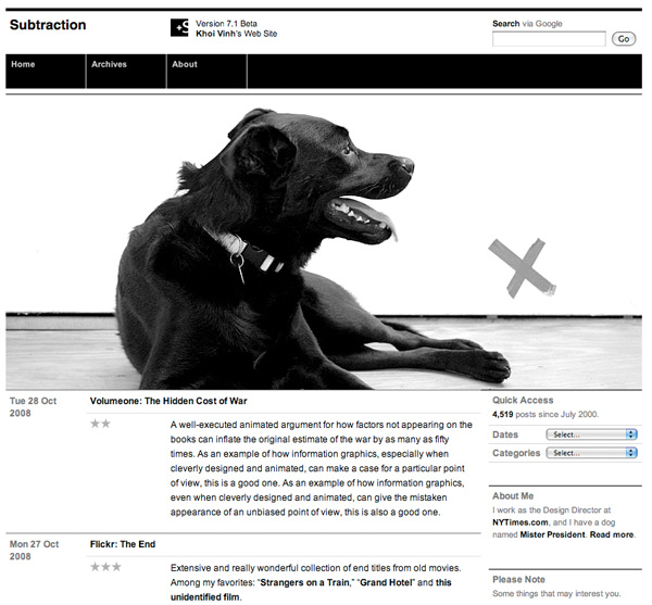
There are a few notable examples of how designing with just black make for a unique and attractive design. Of course, no discussion about designing with black and white on the web would be complete without mentioning Khoi Vinh's site, Subtraction.com. Khoi works with black and white and accents of orange, (in his navigational rollovers), to harmonise with the spare, grid–based Swiss undertones of the design.
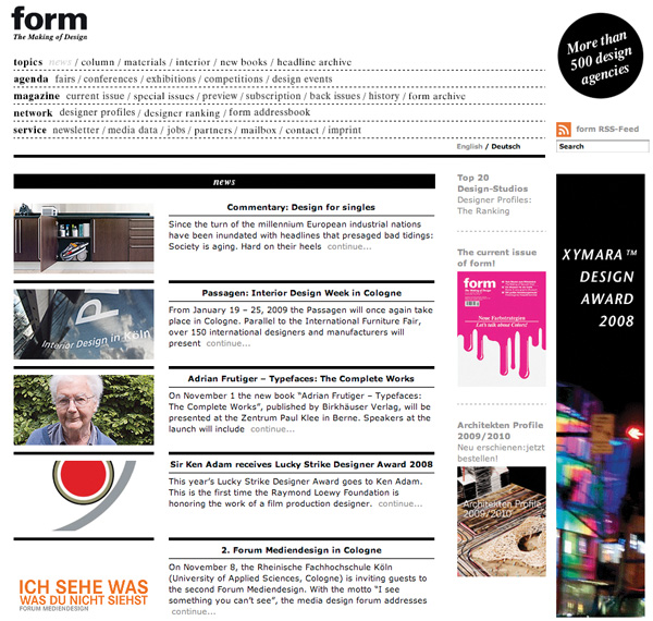
Form, a German design magazine, uses black and white typography, (and a strong grid), to convey its brand to the users of the site. By choosing black and white for the framework of the magazine, any showcased, full–colour work really stands out.
Begin with grey
Next time you start a design, try to follow my simple heading: Begin your design using only tones of grey. Don't introduce any colour until the design is working in black and white. Chances are, your decisions on palette and colour will be made a lot easier because the design – or elements of the design – aren't relying on colour for their function or meaning. This of course is very useful for designing with accessibility in mind. I'm not addressing any accessibility issues within these articles, as I'd like to focus on the graphic design, but it's an important consideration that shouldn't be overlooked. Designing with black and white first will ensure that the solution doesn't rely on colour to work.
I often use colour to highlight specific elements of the design, but generally those elements have a function within the design solution, such as the horizontal lines on this site. Another example might be highlighting a search button, or elements of a navigation bar. Using colour to pick out key functional elements in the interface. The benefit of working this way, like other tools at the disposal of designers such as grid systems, is that it solves a certain amount of problems for the designer. I find it focusses my attention on tone and composition so that I needn't worry if this colour matches that. Focus on the composition's tone and, once that's sorted, move on to the colour.
More from this part
- Chapter 16 – The Colour Wheel
- Chapter 17 – Hue, Saturation and Brightness
- Chapter 18 – Colour combinations and mood
- Chapter 19 – Designing without colour
- Chapter 20 – Colour and Brand
Download the book
Download your FREE copy of Designing for the Web.