Chapter 11
Typographic design is one of those fields in design that is taken for granted. Many designers just choose a cool font and away they go. Lacking an understanding of the subject as a whole, some see it as the designing of typefaces, whilst others see it as being closely related to the printing industry or print design. Some just see it as fonts. Well, it's all of those things and more.
In 2005, Information Architects, a small web agency in Tokyo, Japan, wrote a couple of articles on their blog. The title seemed to cause quite a stir: ‘95% of the web is Typography’. It may not come as much of a surprise, but I agree. Of course, the User–Experience Consultants in the industry will tell you the web is about how users interact with and experience the websites and services they use – it's not just about typography. But what facilitates the experience? Words, mostly. What is the practice of setting and arranging words to convey a message or interface? Typographic design. Information Architects were bang on the money in my view.
Typography is a core building block for brands. Companies such as Microsoft, Audi and the BBC are instantly recognisable, in part due to their typography. This is one of the interesting things about typography on the web. We can't guarantee the fonts that are installed on a user's machine, therefore, we can't rely on bespoke fonts, or specific brand typefaces, in order to convey a brand. This is where a good understanding of the craft of typographic design can make all the difference. When we first look at typefaces, only the most dramatic differences are apparent. With our lack of experience, we could see the difference between serif and sans–serif, but had no clue which typefaces were good and which weren't. Someone more experienced would come along and completely transform a dull page into a work of clarity and beauty just by changing the typeface. We knew the typeface they'd chosen was better – but why?
Knowing the history of typography, the anatomy of letters, and the classification of typefaces helps us in many ways, even when using the limited fonts supplied by browsers or – with the use of image replacement techniques–thousands of others. Immersing ourselves in typography in design school, and studying these aspects of typefaces, we become keenly aware of even subtle differences between them. We learn to see typefaces in an entirely new light: when the use of each was appropriate; when their features best expressed the intent of the brand, author, or project; and when the use of one face rather than another was an elegant, thoughtful choice, giving a certain ‘look’ to a page. We learn to stop and think about type.
Anatomy
Typefaces have defining characteristics that give them personalities.
Typefaces, like other elements of design, such as colour and imagery, communicate. They have defining characteristics that give them personalities.
A good designer will be aware of the different characteristics of typefaces and match those characteristics with the story they are trying to tell. The characteristics of type can be broadly categorised, as we'll see in the following section, based on some of their main design elements.
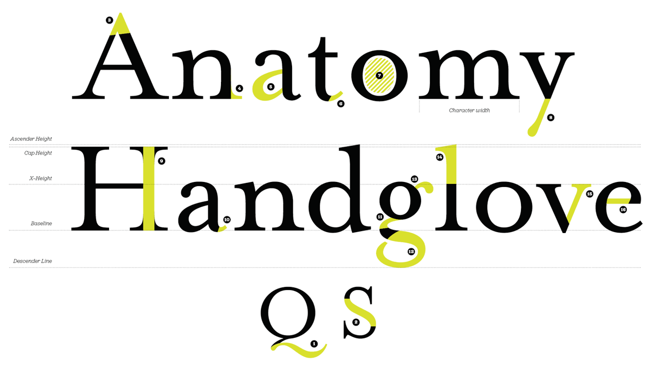
- Tail
- Spine
- Apex
- Serif
- Bowl
- Finial
- Counter
- Descender
- Stem
- Spur
- Link
- Loop
- Ear
- Ascender
- Arm
- crossbar
More from this part
- Chapter 11 – Anatomy
- Chapter 12 – Classification
- Chapter 13 – Hierarchy
- Chapter 14 – Typesetting
- Chapter 15 – Printing the Web
Download the book
Download your FREE copy of Designing for the Web.