Chapter 15
Printing the Web
The screen is just one of the media types for which we have to design.
The screen is just one of the media types for which we have to design. Another media type, which I feel is often neglected during the design process for a website, is print.
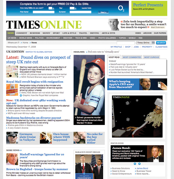
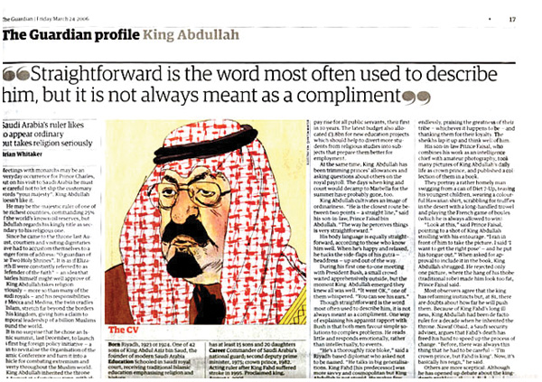
There are times when a web designer has to know about print design–not just the values and aesthetics of designing for print, but the terminology, measurements and production values that are important in print, including typesetting. Print alternatives to web pages have been around for a while; we've all seen them, in one form or another. Usually, they are associated with a ‘print version’ button, which upon clicking, renders the page without any navigation and, if you're lucky, increases the font size. This is generally about it. Many sites offer this functionality but I have to question whether, due to time constraints, users click this button, or if like me, they just print the page straight from their browser. In which case they will get something like these images, (prints from Guardian Unlimited and The Times).

There is a way, other than ‘print only’ versions, of rendering this content for a printer. I'm referring to print style sheets, or, more specifically, a CSS file, which has been authored for print media and declared as ‘print’ in the ‘media’ attribute of the link tag.
The last to be thought about
It's been my experience over the past few years that, despite a very clear need for users to print out web pages, designers very rarely address this need. Why is that? Do we think that print is important in a screen–based environment? Jason Santa Maria, graphic designer, had this to say when I asked about it recently:
“Many people still see the web as a temporary medium, one that is always changing and where content is potentially irretrievable. I know many people who love to print things they find on sites, from articles to recipes to photos, to view when they are away from the computer or for their own personal archive. There's no reason that information shouldn't either support your brand or be designed with the same care as your site.”
Khoi Vinh, Design Director of NYTimes.com and the popular weblog, Subtraction.com, agreed with Jason:
“Having developed web solutions for many text–heavy publications in my career, at least one user scenario remains: people like to print long passages of screen–based text for reading offline.”
This then begs the question: If printing from the web is so important for users, then why do we see print–based templates either being left to the last minute, or being developed by technical teams, rather than designers? In addition to implementation though, what else influences the decision for offering a print alternative? Khoi makes some valid points about revenue generation, through advertising, in the print versions:
“Designers are focused on the immediate, knowable and sharable result of what gets rendered on the screen, so it's natural to consider print media stylesheets an afterthought. But other factors contribute to this, too, notably the monetization of 'printer friendly' versions of articles at many publication sites. That is, rather than offer a print–based set of CSS rules, many sites will offer an alternative screen rendering of the same article, slimmed down to just the primary text– we've all seen this. Very often, those print–friendly views are sold to advertisers for sponsorship, so in those cases at least, there's a financial reason not to create a print media style sheet.”
This is something that I hadn't really considered when researching this book. Jason also raised some interesting points about the medium:
“Because print stylesheets are perceived as somewhat non–essential to most site creators, their main focus is their website and the appearance of it in various browsers. I think many people see print as a secondary medium, like mobile phones, that is optional. And I suppose it is a secondary medium, as far as the web is concerned, but there is very little preparation involved in producing some simple styles for print.”
Perhaps designers assume that because print styles are deemed secondary that they can be added at a later date. This can, at times, be true, but developing the example for this book, I found that creating a print style called for revisiting the code in the template to make sure the content flow was correct and that design elements could be added. So, in that sense, I'm not sure that assumption is true.
Now that I've given you some context, I'll get into the actual design of the printed page.
Printing the web: The Guardian
For a good example, I looked for a text–heavy site, with a strong on and offline brand that could benefit from print styles. I chose the British newspaper, The Guardian. Why? Well, The Guardian has an established website. The paper version was recently redesigned and now there is somewhat of a gap between the appearance of the website and printed material. The first task was to design what the printed page from the website would look like.
Design the printed page
I feel the process of designing the printed content of a website is as important as designing for other media: screen readers, mobile and small screen. The design process is the same as designing for any other media. You have to understand the context, the production and the delivery. Luckily I chose an example with a very strong offline design from which to draw inspiration. I began by researching The Guardian's redesign and analysing its components: the grid, typography, colour and composition.
I chose a typical page layout, which included running heads, article headline, date, author, noting all the content that would go into the online version. It was clear from this example which areas of the design I would need to replicate to ensure a quality reproduction for the print styles. I then began to shape up the design.
Shaping the page
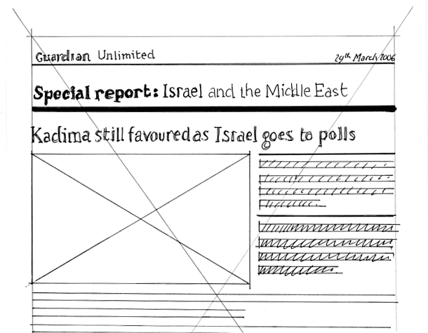
I begin most design tasks by drawing thumbnails. This one was no different. As you can see, I knew there were some important issues I wanted to address even at this early stage. Width of the measure is an essential consideration for printing on an average desktop printer. I opted for a full–width measure. Although this may hinder legibility due to the long line length, I feel this is acceptable, considering the potential savings on paper and toner if the measure was narrower.
From this quick sketch, I worked up a larger, full–size sketch to get an idea of proportion of type areas, rules and white space. Working at this full size, in pen and paper, gives an immediate idea of the scale of the elements on the page. I really would recommend this for when you design print alternatives for your websites. Draw it out on paper first. It's quick and will save you a lot of time in the long run.
Digitising and colour
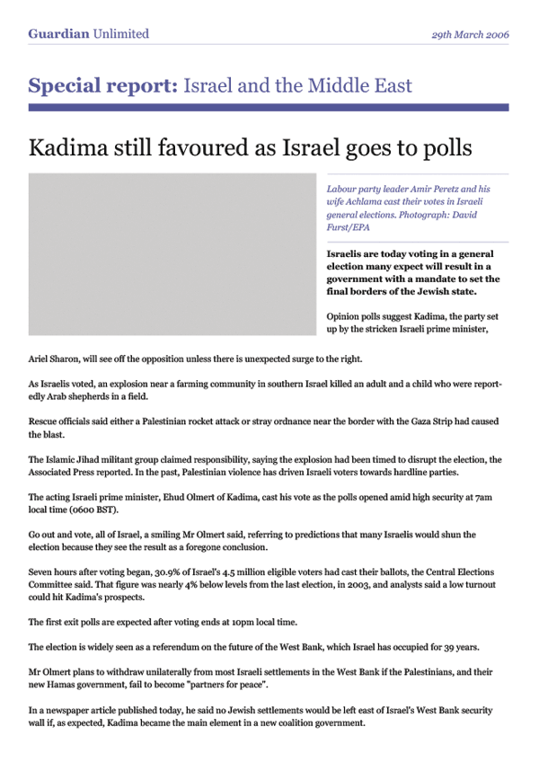
I then took the sketch and worked it up in Photoshop, (you could use InDesign or Illustrator if you like), to use the typeface I wanted and to add colour.
Working at this full size, and then printing it out, gave me a template on which to base my CSS measurements. Remember, with the printed page we are dealing with absolutes again, rather than fluid layouts or differences in browsers. You can define type size, leading and measurements, which all exist in a finite space: a piece of paper. I found that completing this stage of the process really helped in pulling the styles together later on.
The finished article
This shows the finished printed article page shown next to an open spread of the paper. As you can see, it shows a continuation of the brand and the content is presented clearly and legibly.
A few rules of thumb
This is a bit of a disclaimer. Most browsers print differently – wildly. If you develop a print stylesheet, with an intricate layout on Safari, and then print it using IE on a PC, chances are, it will break. Although it's possible to create fantastic layouts using CSS and print media stylesheets, the reality is, you have to keep it fairly simple.
- Avoid using absolute positioning.
- Use points for your type measurements. For printed text, standard 9–12 pt type is considered optimal for legibility.
- For line–height of 9–12 pt type, set the value to the type–size plus 1 to 4 pt. Incidentally, in graphic design, 9 pt type with 13 pt leading is written in shorthand as 9/13, (which looks like CSS, but isn't), and is spoken as ‘nine on thirteen’.
- Consider changing your markup. Your html markup is not sacred. If there is a need for print stylesheets, then adding class names–such as ‘standfirst’ to a < p > tag – is perfectly acceptable.
- Optimise to black, white and grey. By all means make your printed page in colour, but be careful of legibility when it is just printed in black and white. Always check it first because many readers will be using black and white printers.
- Experiment with typefaces. Some typefaces don't work on screen, but work very well in print and are available on almost every computer, (Zapf Chancery, for example).
- Don't use too much black. You'll waste loads of toner and your users will hate you.
- Always set type smaller than you think. The default type size in Microsoft Word is 12pt. That's the largest you really should have to set text.
A final word
Typography has suffered from the advent of technology, (and I'm not just talking about computers here). Designers on the whole have divorced themselves from the letterforms and the setting of them. As a result, they've forgotten, or not been made aware of, the simple typesetting rules which were core to the old system of printers' apprenticeship. Typography to me is about design. It's about words and the conveyance of meaning. It's about setting words that people read. A certain amount of it is creative, a certain amount is expression and aesthetics, but mostly, it's about people reading stuff. Do them a favour and don't make it difficult.
More from this part
- Chapter 11 – Anatomy
- Chapter 12 – Classification
- Chapter 13 – Hierarchy
- Chapter 14 – Typesetting
- Chapter 15 – Printing the Web
Download the book
Download your FREE copy of Designing for the Web.