Chapter 22
Chapter Twenty OneThe Basics of Composition
For centuries there has been a link between art and mathematics.
For centuries there has been a link between art and mathematics, but how can you quantify beauty? How can you create a formula for aesthetic appeal? Philosophers, mathematicians, architects and artists have tried to answer these questions for thousands of years.
During art college I was subjected to a lecture on the Golden Section, (who remembers that lecture, come on hands up?), that ambiguous set of rectangles that is requisite art school discussion. During this lecture I was shown slide after slide of seemingly tenuous links between paintings and sculptures, and this set of rectangles. My lecturer at the time seemed as equally uninterested, droning along in self–imposed boredom. What he failed to convey at the time, has taken me over 15 years to even begin to understand. So what is the importance of these boring rectangles and how do they relate to design?
The Golden Section
Many theories on aesthetic measurement have their basis in numerical patterns that occur naturally such as the proportions of the human body, for example the distance between your elbow and the tip of your fingers compared to the distance between your elbow and your wrist. Theories, such as the Golden Section, (and its many other names), arise from these natural patterns and they are applied to art, (either consciously or subconsciously), to create ‘beauty’ by way of considered composition.
The Golden Section, Golden Ratio, and the grandiose Divine Proportion are all names for the same thing; a ratio of 1.618. Nodding off? Not yet? Good! Bear with me. Here's the math: the Golden Ratio is the ratio between two segments so that the ratio between point ac/bc is 1.618. This may not seem that important, but the Golden Section is found throughout nature, mathematics, architecture, art and design. It is derived from a naturally occurring number, called Phi, which has intrigued humanity for thousands of years. Many usages of the Golden Section in art – and architecture specifically – were no doubt by complete accident. Artists and architects are visually–aware people. Those early experimenters were in tune with the proportions of their surroundings and incorporated what they saw into their art. They did it because it felt right. And it's this word, ‘felt’, that interests me.
Throughout art school I was taught to ‘feel’ my way round composition. I was taught that when something was right, it ‘felt’ right. This school of thought went all the way up through college to university and my first job as a designer. Composition was about feel, not thought. This seemed to go against the very nature of what I understood to be design communication and problem solving. The biggest problem with the Golden Section is the mathematics involved. Using the ratio as a basis for deriving layout measurements is, frankly, a bit of a nightmare. Very quickly, you can end up with unworkable numbers. This is where the Rule of Thirds comes in.
The Rule of Thirds
Photographers have used the Rule of Thirds for years, who borrowed it from, yet again, classical artists and architects. The theory is simple – which is why it's easy to apply in your day–to–day design work. Divide any workspace, or layout, into thirds horizontally and vertically, and align key focus points of your composition to where the lines intersect.
The Rule of Thirds is easier to use than the Golden Section. The simple division of space can easily be applied to designing for the web. For fixed width designs, (E.g., 960px wide), the space can be broken down into three 320px columns. For fluid designs – those that use percentages for layout – they can be divided into 33% columns. The challenge, however, for applying this theory to modern web design, is that we can't be sure on the vertical space. This is where subdividing the Rule of Thirds comes in handy.
On a web page, we can't be sure how long a page will be. Therefore, we can't apply the Rule of Thirds to the vertical space, but, we can attempt to put some loose guidelines in place. We start by dividing the 960px wide ‘page’ into thirds, giving us three, equal columns of 320px wide. We also use the same measurements vertically. This will give us nine equal squares of 320px by 320px. What I'm really interested in here, is seeing how we can use this simple sub–division to create guidelines for nearer the top of the page – this is where a designer will have the most control of vertical space.
Now, I sub–divide each square into nine equal squares. I'm slightly jumping ahead of myself here, as this is now starting to look like a grid, and I'm going to come onto talking about that in a couple of chapters time.
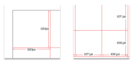
The only problem with this is that we start getting odd numbers cropping up. 320px divided by 3 is 106.66666. We can simplify this by rounding up to 107, but having the last division as 106. Remember, this is only for approximate guidelines for layout. Now, we have some horizontal lines that we can use as a basis for laying out elements on the vertical plane. The same process can be done with percentages for fluid width designs. The beauty of this process is that vertical space is now not based on any arbitrary values. There is a direct relationship between anything aligned to these lines, to the overall width of the design, to the width of the columns, to the width of the sub–divisions and so on. Any composition based on this grid will hang off this connected ‘skeleton’.
Looking Room
Think back to last night. There you are, settled down in front of the TV, watching your favourite soap opera, with a nice hot cup of tea in hand. Did you notice – whilst engrossed in the latest love–triangle – that the cameraman has worked very hard to support your eye's natural movement on–screen? He's carefully framed individual shots to create balance. Think back to last week. There you were, sat with your mates watching the big match. Did you notice that the cameraman frames the shot to go with the direction of play? A player moving right will always be framed so that he is on the far left, with plenty of ‘room’ to run into. Both of these cameramen use a technique called Looking Room, sometimes called Lead Room. Looking Room is the space between the subject, (be it a football, or a face), and the edge of the screen. Specifically, Looking Room is the negative space on the side the subject is looking or moving towards. The great thing is, it's not just limited to photography, film or television; we can use it in web design too.
Basic Framing
Before we get into Looking Room, and how it applies to web, we need to have a look at some basics of photographic composition. Many web sites use imagery, or photographs, to enhance the content. But even with professionally–shot photographs, without a basic understanding of framing or composition, you can damage how the image is perceived. A simple, easy way to make photographs more interesting is to fill the frame.
Subject, Space, and Movement
Generally speaking, a portrait photograph will have a subject and space around them. Visual interest in portrait photography can come from movement; how the eye moves around the shot. To get the eye moving, the photographer modifies the space around the subject.
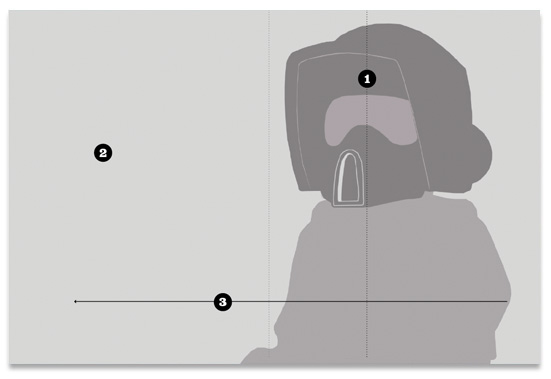
Look at this portrait:
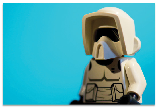
The photographer has framed the subject on the right, allowing for whitespace, or Looking Room, in the direction the subject is looking. The framing of the subject (1), with the space to the left (2) – the Looking Room – creates movement, shown by the arrow (3). Note the subject is not framed centrally, (shown by the lighter dotted line).
If the photographer had framed the subject with equal space either side, (1 & 2), the resulting composition is static.
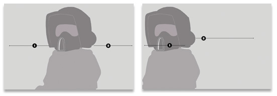
If the photographer framed the subject way over on the left, as the subject is looking that way (1), the resulting whitespace on the right (2) leads to a very uncomfortable composition.
The root of this discomfort is what the framing is telling our eye to do. The subject, looking to the left, suggests to us that we should do the same. However, the Looking Room on the right is telling our eye to occupy this space. The result is a confusing back and forth.
How Looking Room applies to the web
We can apply the same theory to laying out a web page or application. Taking the three same elements – Subject, Space, and resulting Movement – we can guide a user's eye to the elements we need to. As designers, or content editors, framing photographs correctly can have a subtle but important effect on how a page is visually scanned.
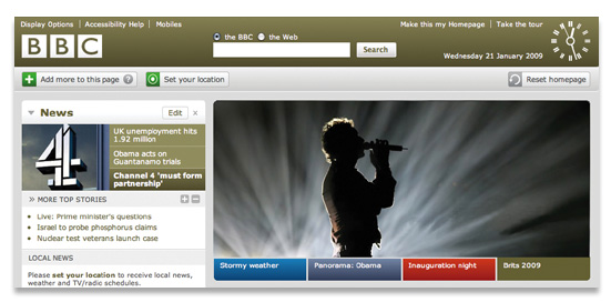
Take this example:
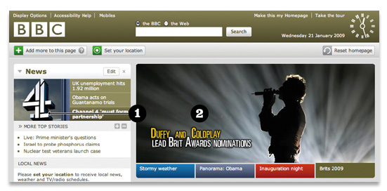
The BBC homepage uses great photography as a way of promoting content. Here, they have cropped the main photograph to guide the user's eye into the content. By applying the same theory, the designer or content editor has applied considerable Looking Room (2) to the photograph to create balance with the overall page design, but also to create movement of the user's eye toward the content (1)
If the image was flipped horizontally, the Looking Room is now on the right. The subject of the photograph is looking off the page, drawing the user's eye away from the content. Once again, this results in a confusing back and forth as your eye fights its way over to the left of the page.
A little bit of Art Direction
Art Direction can be described as the act or process of managing the visual presentation of content. Art Direction is difficult to do on the web, because content and presentation are, more often than not, separated. But where there are images, and when we know the templates that those images will populate, we can go a little way to bridging the gap between content and presentation. By understanding the value of framing and Looking Room, and the fact that it extends beyond just a good looking photograph, we can start to see photography playing more of an integral role in the communication of content. We won't just be populating templates. We'll be art directing.
The Triangle
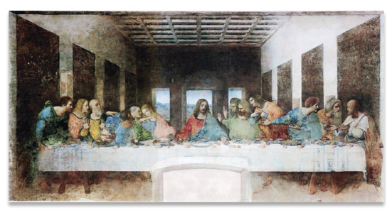
The humble triangle is a powerful aid in composing layouts. For centuries, the triangle has been used to guide the eye of the reader or viewer, particularly in fine art. The Last Supper, by Leonardo da Vinci, is perhaps one of the most well known paintings to use triangles as a primary compositional device.
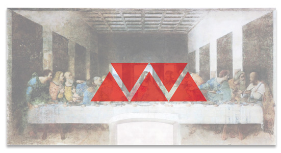
In order to guide the onlooker's eye to the main subject of the painting – Jesus Christ – Da Vinci created whitespace, in the form of a triangle either side of Him. Christ Himself is composed in a triangular pose, with His disciples also adopting triangular poses. A simple, but powerful device for guiding the eye. This theory has been taken and used in photography, architecture, and graphic design for many years. Having three points of focus on a design provides a balance and subsequent movement of the reader's eye. But how can this theory of composition work on the web? An example of how to use this is on the teaser site for this very book.
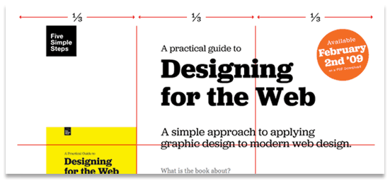
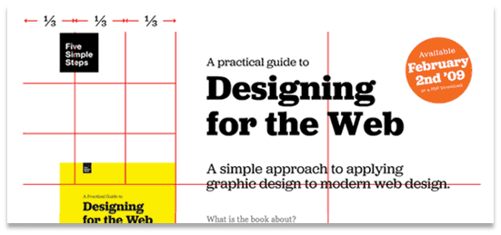
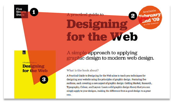
The design for the teaser site was purposefully simple. A few colours, a few blocks of flat colour. With so many spare content elements, the challenge is providing enough emphasis to guide the user. I designed it using the triangle, with the three points corresponding to three important content elements; the Five Simple Steps logo in the top left (1), the orange circle letting our readers know when the book would be launched (2), and the yellow book cover (3). The natural movement of the eye is from left to right in the western world, so the user would naturally begin at the Five Simple Steps logo, move over to the orange circle, and then be drawn to the yellow cover.
The challenge, when using a triangle as a compositional aid, is ensuring it's not overt and overbearing. The triangle should aid composition, not be evident in the design itself – unless of course, that is the intention. The triangle is such a powerful visual device; there is a danger the readers eye will skip from one point to another without reading, or viewing, the content in–between. Any compositional tool – such as those I've outlined in this chapter – are there to help. They can provide answers to tricky layout problems. They can go towards making your designs look better. But, unfortunately for us, they're not a quick fix for every project. Just because you use the Golden Section, or compose your layout based on the Rule of Thirds, it doesn't automatically mean it will be effective. These few tools are just meant to be a starting point.
More from this part
- Chapter 21 – The Basics of composition
- Chapter 22 – Designing for the web
- Chapter 23 – Grid Systems
- Chapter 24 – Breaking the grid
- Chapter 25 – Bringing it all together
Download the book
Download your FREE copy of Designing for the Web.