Chapter 24
Breaking the grid
Should Everything Always Line Up?
One of the biggest complaints from designers that I've heard in relation to grid–based design is that they can limit your creativity.
I don't agree, actually, but I can see how that viewpoint has arisen. Sticking to a rigid grid can seem stifling when compared to a free, creative, fluid design process many designers are comfortable with. At times, designing using a grid can feel more like mathematics or engineering. As designers, it's our natural inclination to want to do things differently. Not to conform. And you know what? That's okay. It's okay to break free of the grid every now and then. In fact, I'd encourage it.
Should Everything Always Line Up?
Before CSS was widely adopted by the browser manufacturers as a good thing, web designers used HTML tables to layout their web pages. At the time, this was good. It allowed web designers to create layouts in a visual language they understood – columns, rows, gutters, (or padding), and margins. But, we all know now that tables for layouts are a bad thing. Now, we use CSS to lay out our web sites. We can still use the same terminology to create our columns and rows, our gutters and margins. The only difference is, we're using different HTML markup in the background. Of course, CSS uses the ‘box model’ to render the various elements such as padding, margins and content. This is good as well – boxes fit well into our columns.
But what happens when we want to break free of those boxes? Why would you want to do that? Grid systems provide answers to compositional problems. They're there to help. But sometimes, it's useful – no, crucial – that we break free of the grid to provide emphasis, importance, visual interest, or increased usability. Sometimes breaking free of the grid is exactly the thing you should be doing. The trick is, knowing when to do it.
Breaking your own rules
First thing to remember is that this is your grid system. You designed it to help you with a layout. It shouldn't be a rigid tool that you can't change. There are many times when I'm halfway through a project, for whatever reason, i realise that the grid system is not helping me. Either there is not enough flexibility in the columns, or I failed to grasp the complexity of the constraints of the project. Both of these things necessitate tweaking your grid system, or, in some cases, going back to the drawing board. And, you know what? That's just fine. Don't beat yourself up about it. Projects are fluid, and things sometimes don't work out. So, change them.
Content Out
Designing grids for print publications is similar to designing grids for the web. For newspapers, the grid design is abstracted from the content – a designer doesn't know day–to–day what content is going to populate the grid. Instead of guessing, a designer needs to establish what content ‘types’ will populate the grid. These can range from simple lists, headings, and paragraphs through to more complex tables and illustrations.
Finding patterns
On the web, most of the time, we don't know what the content will be that will inhabit our templates. However, we can make a pretty good estimation as to what the content types will be. If we're redesigning an existing site, and repurposing existing content, we can look through that content to try to establish patterns. This is called a Content Audit, and is usually conducted by an Information Architect, or a site editor. Whilst useful, the content audit focuses solely on content, rather than content types or patterns. It's a designer's job to delve into this content and try and establish the patterns.
For a new design, the job is somewhat easier and less laborious. By talking it through with the client, you can establish the types of content they need on the new site. Testing or interviewing users will also help massively in giving an indication of what type of content you should be designing. The web is already full of design patterns and conventions for particular content types. For lists, through to comment forms, and registration processes. The web is maturing to the point where we don't need to rethink these patterns from the ground up every time we start a new project. This is where continued research, and being actively involved in the web – both as a professional, and a ‘consumer’ – can really pay dividends. By continually looking at the web, and by using the web, you become familiar with the patterns – you start to see them everywhere.
Designing to worse case scenario
I try and adopt this approach on every design project I undertake. I try and design to the worse case scenario. What happens if the user increases the font size by 200%? What happens if the editor of the site uploads the wrong size image? What happens if an administrator of the site chooses the wrong template for that section? With all of the questions, how can you be sure your design will stand up to it? This is the modern web. Things can ‘break’ very easily. That crafted design is only moments away from looking a complete disaster unless you take steps to protect it.
You may have heard the term ‘graceful degradation’ in web design. That, and ‘progressive enhancement’. The former ensures that sites degrade gracefully in older browsers, but also when other factors influence the presentation such as the user increasing the font size, or Javascript being turned off. The latter describes the use of technology – be it CSS, or Javascript – to take advantage of newer browsers. Well, you can take the same approach when designing the fundamentals of your grid systems. Make sure that when viewed on older browsers, your grid system adapts, ensuring the content is still readable. Ensure that when using newer browsers, you take advantage of new technology available to you – for example, the new tags in HTML 5, such as <header>, or <footer>.
Less, not more
It's easy on any project to bite off more than you can chew. Auditing a site for a redesign may throw up over twenty different content types, all of which have to be designed, built, and accommodated into a flexible grid system. It's a considerable undertaking. So, start off small.
I like to start off any design with establishing the core typographic content types. These are:
- Headings
- Paragraphs
- Lists (unordered and ordered)
- Tables
That's it, just four typographic content types. These will form the basis of probably 80% of your content – in one form or another.
Emphasising content
Emphasis can be given to content in a variety of ways, many of which I've talked about in this book. But, when using a grid system, one of the best ways to draw the user's eye, is by NOT placing that element on the grid. A loose placement on the grid, either by nudging an element this way or that, will make it stand out against its strictly aligned neighbours. Use an image on an angle, or nudge navigation 10% higher.
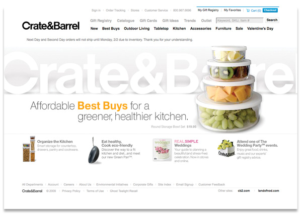
The Crate and Barrel website is a fine example of grid-based design. The under–pinning grid structure provides a skeleton upon which the visual elements of the website are arranged. The grid provides unity between sections:
However, strict adherence to a grid comes with some pit-falls and I believe Crate and Barrel has inadvertently fallen down one of these pits. The site has a calm, even appearance. No doubt, this is by design. But the design has an even appearance that makes drawing attention to any content, button, product, or widget difficult. You can understand the designers wanting to draw attention to the product photography through a simple, clear design. But, with some simple changes of position, we can provide some much-needed emphasis to certain page elements.
Product page: The title and product description are uncomfortably aligned to the grid.
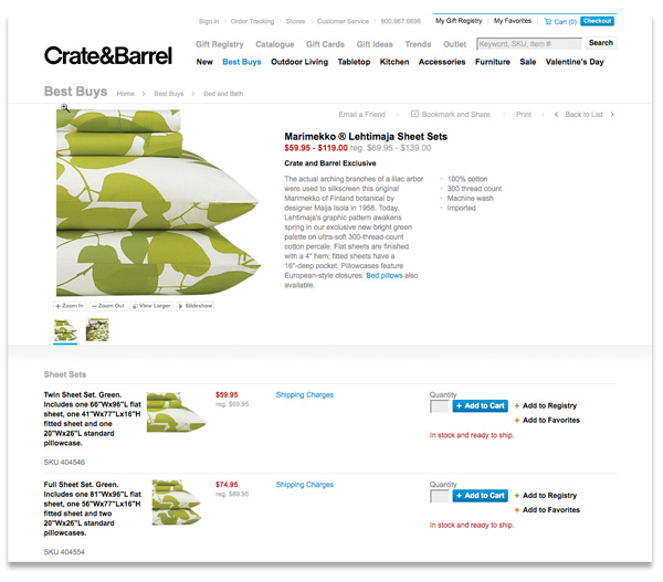 The emphasis, on this occasion, is provided by NOT aligning a content element to the underlying grid. The content element is moved slightly off the line – and the amount is up to you, there is no magic formula for this. It's just enough to show that this element is different, it's special or important, and we want the user to see it as soon as possible.
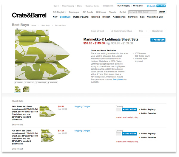
For my version, I keep the title and price aligned, but increase the size and move the description off the grid and align it with the list of links above. It's a subtle, but effective change. The resultant whitespace around the title is now giving emphasis.
Breaking the grid does require an understanding of how a grid is constructed. Just like a building, if you remove, or break some of the load–bearing structure, a grid system will fall apart. If you've designed a grid, and part way through the layout process, things just aren't working out – maybe you're having to create extra columns, or change the size of the unit – that's fine. Don't see the grid as a structure that, once created, cannot be changed, revised or thrown out completely.
More from this part
- Chapter 21 – The Basics of composition
- Chapter 22 – Designing for the web
- Chapter 23 – Grid Systems
- Chapter 24 – Breaking the grid
- Chapter 25 – Bringing it all together
Download the book
Download your FREE copy of Designing for the Web.