Chapter 12
Classification
Typefaces, like most things, are made up of constituent parts.
Typefaces, like most things, are made up of constituent parts. It is the characteristics of these parts that gives typefaces their character.
Serifs
A typeface will have serifs, or it won't. If it doesn't, it's called a sans–serif. If it does, then the serif will either be a bracketed, a hairline, a flare, or a slab serif.

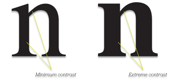
Contrast and whitespace
The relative thickness of the strokes of a typeface determine the amount of whitespace the character has. To introduce more whitespace into a block of text for example, whilst not increasing your leading, you could experiment with using a typeface with less typographic contrast. An example of this would be a typeface that has smaller, or hairline, serifs and wider, more open, counters.
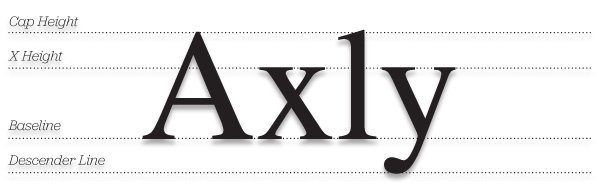
x–height
The x–height of a typeface is the height of a lowercase ‘x’. Different typefaces have different x–heights in relation to their cap–height. X–heights can effect the legibility of typefaces, particularly at a small size. Larger x–heights are more useful for body copy of serif typefaces on the web.
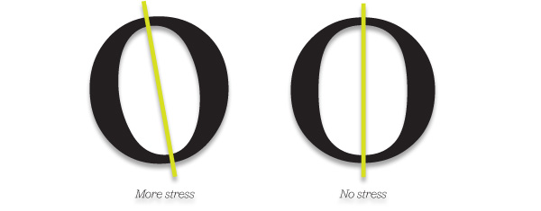
Stress
Stress is the direction of the stroke weight. The more stress, the more acute the angle of the stroke weight. This can give letterforms a more fanciful and intricate appearance.
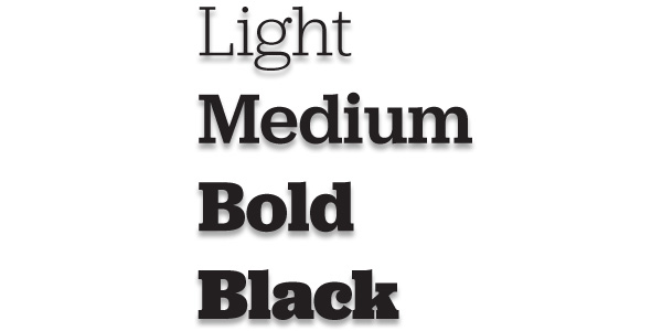
Weight
Weight is the thickness of the stroke weight. This characteristic is perhaps the one of which people are most aware, such as the use of a bold weight.
Classification
Typefaces can be classified into groups based on their different characteristics. Designers have been trying to establish a universally recognised classification system for many years. The most widely accepted one is based on the 1964 classification by the Deutsche Normenausschuss. This system classifies typefaces into ten groups.
1. Graphic
The production of typefaces, as we know them, originated in Germany. Gutenberg, of the famous Bible, used movable metal letters instead of the old wooden pieces, and revolutionised printing in the process. Graphic typefaces, based on this Movable Type* system, resemble the local handwriting called Gothic, Blackletter or Textura. This typeface group is the basis for all those terrible heavy metal band logos. Interestingly, the much–maligned Comic Sans belongs to this classification.
2. Humanist
Humanist is a type style based on 15th century manuscripts. Humanist is also a sub–category of Lineale.
3. Garalde
Modern typeface styles have their roots in Italy. When printing was introduced there, they too wanted to replicate the handwriting of the time. At that time, documents were written in a style called Chancery Italic. Some of the typefaces developed to mimic this style are Garamond, Goudy Old Style and Caslon.
At this stage, you can see how two things influenced type design: the local handwriting style and preference, and the sophistication of the printing process. Gradually, those two drifted apart as the materials for printing, (the presses, paper and ink), allowed for more stylised type designs to be developed.
4. Transitional
Transitional typefaces are lighter in appearance than Garalde. The serifs are more horizontal, and the emphasis is vertical rather than slanted. John Baskerville designed possibly the most well–known, named after himself, in the mid 18th century.
5. Didone
Didone is home to elegant type with highly contrasting strokes and hairline serifs. Bodini is perhaps the typeface that exemplifies this group.
6. Slab Serif
As technology advanced, so the type designs changed. The Industrial Revolution brought with it the introduction of mechanical typesetting. It also fueled an advertising market that demanded strong and powerful typefaces to sell products. Slab Serif, or Egyptian, type designs were born. A good example of a classic is Rockwell. A more contemporary version would be the typeface for the new Guardian newspaper redesign in the UK.
7. Lineale
This is the classification for sans–serif typefaces. Originally designed for posters and headlines, sans–serif typefaces quickly became standard fare for printing. This group is divided into four subcategories: Grotesque, Neo–grotesque, Geometric, and Humanist.
8. Glyphic
This categorisation has been the centre of some debate over the years. Glyphic is supposed to be the classification of stone–carved forms, rather than handwritten forms. However, stone –carved forms are based on hand–painted letter forms, (it's where serifs are widely regarded as originating from).
9. Script
Script type designs emulate ornate, swishing handwriting.
10. Stylised
Stylised type designs are one large classification for all those weird and sometimes wonderful typefaces that have become available since the advent of cheap computers and programs which allow anyone with a bit of skill and an idea to create and distribute a typeface.
Iconic typefaces
At certain times, typefaces can come to represent a specific era. It takes a collection of designers or typographers to suddenly start using a particular typeface in influential publications for the snowball to slowly start gathering momentum. Before you know it, the most unlikely of fashionable typefaces crop up in unfashionable places.
Poor Template Gothic
As a young designer in the 1990's, I was reading all the publications everyone else was: Emigré, Raygun, Eye, The Face, etc. During this time, Emigré was very popular amongst my industry peers. They produced and commissioned typefaces as well. One proved to be so popular in the 1990's it was a victim of its own success and was overused. As a result, I don't think I've seen it used by graphic designers in the last ten years. The typeface was Template Gothic, designed by Barry Deck.
The first time I saw Template Gothic in use, (rather than only being displayed in Emigré), was in the mid–nineties in Raygun magazine. Raygun was the music magazine piloted by every designer's hero of the time, David Carson. If David Carson thought this typeface was cool, then of course, we did too. Every designer across the globe began to set headlines in Template Gothic. Then, the fashion spread from editorial design to advertising and finally, packaging. It was at this point, as had happened to Helvetica Light/Thin in the early nineties, every designer stopped using it–except the bad ones, of course. Template Gothic was then shunned by most designers, as it was used in the most inappropriate places–a real shame.
What makes a classic?
A classic typeface is like a classic suit: durable. It can be used to convey multiple messages on varying media over decades–sometimes centuries. It survives fads, it's versatile, and it's so well designed that designers from different eras or with different tastes respect it.
Other examples of classic or iconic typefaces
VAG Rounded
VAG Rounded was commissioned by Volkswagen and Audi Group, (hence the name). Similar in many ways to Helvetica Rounded, VAG Rounded has a youthful, playful feel and has been widely used for all manner of applications – from refrigerator magnets to children's toys.

Meta
Like most typefaces, Meta was designed for a specific purpose. It was designed by Erik Spiekermann as the corporate font for the Deutsche Bundespost, the German equivalent of the Post Office. Like Helvetica, Meta has been widely used as a corporate typeface. It has a somewhat soulless character, (though not as much as Helvetica), which makes it easy to adopt as a corporate typeface– it's safe, clean, and modern.
Mrs. Eaves
Mrs. Eaves is actually a redraw of another classic, Baskerville, by type designer Zuzana Licko, of Emigré font foundry. Its elegant italics and ligature weight captured designers' imaginations in the late 1990's. Emigré released a very useful little application with this font that made setting type with the extensive ligature characters, (which we'll discuss later), as simple as copying and pasting – years before widespread Open Type adoption.
* Movable Type is the system of printing and typography using movable pieces of metal type, made by casting from matrices struck by letterpunches.
More from this part
- Chapter 11 – Anatomy
- Chapter 12 – Classification
- Chapter 13 – Hierarchy
- Chapter 14 – Typesetting
- Chapter 15 – Printing the Web
Download the book
Download your FREE copy of Designing for the Web.