Chapter 13
Hierarchy
Typographic hierarchy, put simply, is how different faces structure a document
Typographic hierarchy
Typographic hierarchy, put simply, is how different faces, weights and sizes of typefaces structure a document. It may do this by separating sections, by indicating the degree of importance of each piece of information or by making the organisation of the document immediately apparent to the reader. Some of these hierarchical devices are well–established conventions, such as cross heads and folios.
To keep it simple I'm going to concentrate on two things: size and weight. Early typographers usually created their manuscripts using one font, one size, and one colour, interspersed with hand–painted illuminations. The product of such typographers gives a flat quality to the information, almost mesmeric.
Take a look at some early manuscripts and the letters themselves–especially the older Blackletter styles– appear similar. M's look like u's, y's look like p's and so on. As beautiful as these manuscripts are, other than the illuminations, they are devoid of structure within the content. There is no typographic hierarchy.
Evolution of the scale
In the Sixteenth Century, European typographers developed a series of typeface sizes, a scale, (the musical analogy is a good one – stick with me). As shown in the diagram, they are sizes we're all familiar with. Six point through seventy–two point type has remained pretty much intact for over four hundred years. In fact, they are the default font sizes in many applications, (give or take a few).
So, what's so special about these sizes? Well, because this scale of sizes has been used for centuries, and the size of each point in the scale relates in a specific ratio to the size of the others, if set correctly type in this scale will appear more pleasing to the eye. An interesting point: originally the sizes in the scale were referred to by name instead of by point size.
Here are a few examples of some of the older names:
- 6pt: nonpareil
- 7pt: minion
- 8pt: brevier or small text
- 9pt: bourgeois or galliard
- 10pt: long primer or garamond
- 11pt: small pica or philosophy
- 12pt: pica
- 14pt: english or augustin
- 18pt: great primer
- 21pt: double small pica or double pica
- 24pt: double pica or two–line pica
- 36pt: double great primer or 2–line great primer
New software and modern methods of typesetting, have allowed character heights that fall outside of, and within, this scale. This freedom has resulted in a typographic free–for–all, allowing designers to pick sizes that may not be related to one another as they are with this scale. Is this a bad thing? I'd argue that it is. Let's go back to the music analogy. It's like composing a discordant piece of music: clashing notes, clashing type. If it's clashing you're after, that's fine. If, however, you're after harmony and melody that stands the hairs up on the back of your neck, stick to the notes in the scale, folks!
Application of the scale
So let's put some of this into practice. I'm going to use my design studio's website, markboultondesign.com, as an example.
I started off designing this website with something very specific in mind – strong typography. I wanted to make sure this site would work based on a simple, clear hierarchy of typography set against a simple modular grid, with plenty of white space on which to 'hang' a number of design elements, (the company's work, for example).
Following the typographic scale described in the previous section, I set about applying this to the CSS–based design. These are the elements for the typographic hierarchy. Note, I'm using pixels as my base measurement, not points. And, yes, I do know the pixels are different on different platforms, (for example, Mac versus Windows).
The thing about type sizes in CSS is that if you want to remain true to typographic tradition, you must specify ems or percentages based on an absolute unit of measurement – in this case a pixel. If you use the relative – small, x–small etc. – there aren't enough declarations to complete the scale, and the sizing of each increment is fixed at 1.5 going up the scale or 0.66% going down, (apparently this depends and was also changed to somewhere between 1.0 and 1.2 in CSS2). Anyway, I don't want to get fixated on the best CSS approach to this. This chapter is about typography, not CSS.
These are the pixel sizes for my main headings:
- 11px / 16.5px – Body copy and leading.
- 24px – Main heading used as section headings on the home page, portfolio home page and entries.
- 18px – Headings for journal entries and portfolio subheadings.
- 16px – All navigational and content tertiary headings.
- 13px – All other headed elements.
This would give me the following styles visually:
These translate in the following way in CSS, using percentages for scaling purposes, basing the scaling from an 11px base size.
- 11px / 1.5em – Body copy and leading.
- 218% – Main heading used as section headings on the home page, portfolio home page and entries.
- 164% – Headings for journal entries and portfolio subheadings.
- 145% – All navigational and content tertiary headings.
- 118% – All other headed elements.
So, within my CSS file, it looks like this:
body {
font: 11px/1.5em "Georgia";
}

h1, h2, h3, h4, h5, h6 {
font-family: georgia, times, sans-serif;

font-weight: normal;
}

h1 {
font-size: 218%;
}

h2 {
font-size: 164%;
}

h3 {
font-size: 145%;
}

h4 {
font-size: 118%;
}
Using these values for the size of the headings creates a natural relationship between them. The typography is harmonious as a result and it only took about five minutes to implement.
Size really does matter
It really does. If you take anything away from this chapter, please let it be this: Stop and think about your type sizes, just for five minutes. Plan them; don't just choose whatever you feel like from the dropdown in Photoshop. Make sure they are 'in tune' and then apply the theory to whatever medium and content you are designing for.
Style and weight
Typeface weights are the different styles within a typeface family. It can be confusing, as the term ‘weight’ does not mean ‘more bold’, or ‘heavier’. Many typefaces have a core set of weights: Roman, (normal weight), Italic, Bold, Bold Italic and Small caps. There are many variations to this, and many typefaces have a huge range of weights, from Thin, through to Extra Bold, from Ornamentals to Ligatures.
Typeface weight, and the choice of weight, is perhaps one area of typography that to most designers is simply a matter of choice–they are presented with an entire family of weights within a typeface to choose from. That choice is often dictated by answering a design problem that is aesthetically or content–motivated. Maybe a designer wants to set some headlines in ALL CAPS just for some variation; all he has to do is choose that weight from a dropdown or to define it in their CSS. What many designers do not realise is that there are rules which should govern the choice of weight, (a typographic pecking order), which when followed, aid the designer's typesetting and can produce stunning results.
Solving the design problem
Let's start by addressing the root of the decision to set type in different weights to solve a design problem. I mentioned that this problem stems from two main concerns:
- An aesthetic problem. The designer sets type in a certain weight to add style or solve some kind of visual or compositional issue.
- A content problem. The designer needs to set a different weight because the content dictates it. The main reasons are that the language of the content may dictate special typographic treatment, the tone of voice may be different, it may be a quote, or it may be a structural device such as an unordered list.
There may be other reasons as well, but I believe these are the main cause.
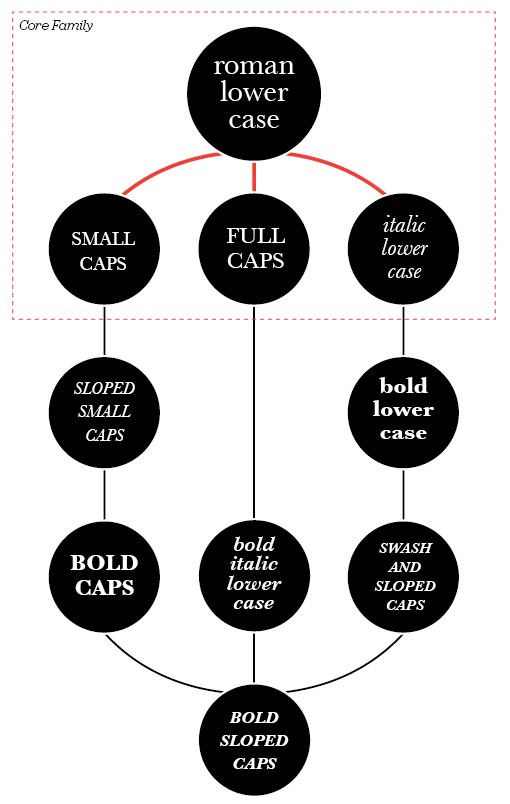
Here you can see some of the weights set out and joined by lines. The red lines represent the core typeface family. Some typographers would argue that without these core weights, typefaces are reduced to being used for titles only. I'll leave that one open for debate! The other lines show how designers can move along the lines when setting type. For example, if a designer has set type in roman and they need to add emphasis to a certain point in the copy, they would follow the lines to any on the second lines – bold lower case, small caps, full caps, and italic lower case or sloped small caps. If they were to jump to, say, bold italic lower case, or a more extreme example, bold sloped caps, the effect would be horrible. If the designer is setting type in bold lower case they could go on to add bold caps, or bold italic lower case without much bother. You get the idea? So, following this simple roadmap can ensure that your typography adheres to some simple hierarchical rules and as a result your typography will take on a harmonious feel. Don't just take my word for it though, set some type, use the rules and you'll see.
First a bit of history
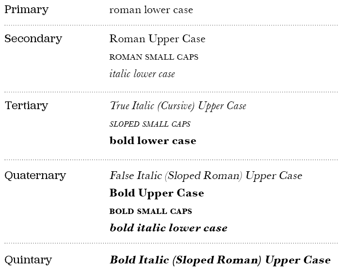
Uppercase and lowercase, and the relationship between them, have been around for over twelve hundred years. Small caps, ornamentals and Arabic figures were early additions to the roman. Italics were a strange bunch to begin with. They didn't associate themselves with lower case roman, as we usually see today, but with roman caps and small caps. It's only in recent times that usage of italic, within roman, was deemed to be typographically correct. Some of the newest additions to the weights of typefaces came with bold, and condensed, as late as the early nineteenth century. These were generally used in place of italics and small caps. Bold typefaces have now become a standard way of differentiating in typesetting, particularly on screen where italics are a little more difficult to read. A type family with all of these weights forms a balanced series that is not only historically accurate but creates harmonious typography. If the setting of copy was reversed, so italics were used as body copy, Caps was used as pull–quotes and bold was used as access structure, (folios, running heads etc), not only would the body of text look terrible, it would also be very difficult to read.
More from this part
- Chapter 11 – Anatomy
- Chapter 12 – Classification
- Chapter 13 – Hierarchy
- Chapter 14 – Typesetting
- Chapter 15 – Printing the Web
Download the book
Download your FREE copy of Designing for the Web.