Chapter 14
Typesetting
The font industry is big business, and rightly so.
Typographic design is such a large topic in the practice of design that some of the constituent parts need a bit of individual attention.
Take type design, for example. The font industry is big business, and rightly so, but to many people this is what typography is, simply choosing a font. That's it. ‘My typography is done, move on to the colours.’ Hang on one minute; you've forgotten typesetting.
Typesetting, as defined by Dictionary.com, is:
“To set (written material) into type; compose.”
Not very enlightening, but the word ‘compose’, used in this context is an important word. 'Composition'' amongst the many definitions relating it to typesetting, I like this one:
“Arrangement of artistic parts so as to form a unified whole.”
Typesetting has a rich history in the craft of the printing trade where compositors worked, by hand and later by machines, to produce printed material. Then, along came desktop publishing and things changed. The basic principles, (I'll get onto some of them), remained the same, but something was lost in translation. Typesetting was no longer being done by skilled tradesmen, (compositors), but by graphic designers, who arguably didn't have the skills, but were cheap because they worked on labour–saving computers. So, from the late 1980s onwards, typesetting suffered and, as a result, typography suffered.
This may be a little melodramatic for the print–based world, but things are a whole lot worse on the web. True, there are technical constraints relating to which font you can have, but as I said, there's more to typography than the font.
The measure
The ‘measure’ is the name given to the width of a body of type. There are several units of measurement used for defining the measure's width. The three basic units are:
- One point = 1/72 of an inch
- One pica = 12 points
- One em = The distance horizontally equal to the type size, in points, that you are using, e.g., 1em of 12pt type is 12pt.
But, with the advent of DTP packages and website design the following are also now used:
- Millimetres = mm
- Pixels = px
- X–height = ex
There is a measurement of ex in CSS which relates to the x–height of a character, (at least it's supposed to), but in reality it's half an em. The x–height isn't embedded information in most fonts, so the browser just interprets it in terms of ems. Interestingly, this is one thing that IE5 on a Mac did well; it internally renders a lower case x, of the font you are using, and then counts the number of pixels.
There is an optimum width for a measure, for legibility, and that is defined by the number of characters in the lines on a page. A general good rule of thumb is two to three alphabets in length, or 52 – 78 characters, (including spaces). Keep your measure within these guidelines and you should have no problem with legibility. Please note that this figure will vary widely with research; this is just the figure I use and it seems to work well as a general rule of thumb.
CSS and fluid layouts?
How does a measure react to the increase and decrease in size of the body of text in a fluid layout? The entire grid would have to adapt to these CSS–defined changes. This is an interesting discussion point and challenge. While staying true to the philosophy of the fluidity of web design, the designer must still make readability a priority.
The measure and leading.
A fundamental rule is that your leading should be wider than your word spacing. This is because when the balance between them is correct, your eye will move along the line instead of down the lines.
If your measure is wider than the guidelines for optimum legibility, then increase the leading – or ‘line–height’ as it's sometimes called. This will have the effect of increasing legibility. Your leading should increase proportionally to your measure. Small measure, less leading. Wide measure, more leading. It's a simple but effective rule.
Reversing out?
When reversing colour out, e.g., white text on black, make sure you increase the leading and tracking, and decrease your font–weight. This applies to all widths of measure. White text on a black background is a higher contrast than black on white, so the letterforms need to be wider apart, lighter in weight and have more space between the lines.
Tracking
The general rule of thumb in tracking your words, (not the characters), is that the shorter the line length, the tighter the tracking should be, and longer line lengths call for looser tracking.
Your responsibility
Following these simple rules will ensure your bodies of text will be as legible as they can be. These rules come from a typographic craft background and unfortunately, for our industry in particular, they aren't being taught as much as they should be in the art schools around the world. As a result, they aren't being practiced and correct, well–considered typography is taking a nose–dive. It's our responsibility, as designers, to embrace the rules that were born of a craft that goes back hundreds of years.
Leading
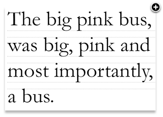
Leading, or line–height, is the distance between lines of text. The term comes from a time when blocks of letters were spaced by adding lead strips. The more strips that were added, the more the leading. For most applications, you should add a little more leading than you think necessary. For 9pt type, I always set my leading at 13pt, which is right at the supposed tolerance level for legibility. Type can be aligned to the leading values in a document – this is called a ‘baseline grid’ as shown below.
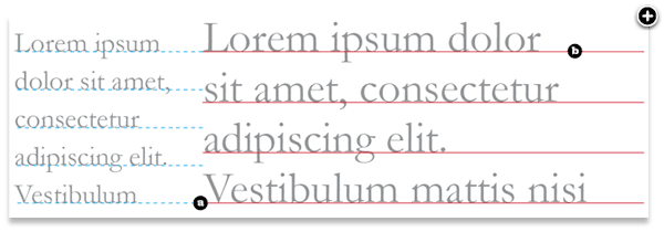
Leading can also have fractional values of this baseline grid, which is called ‘incremental leading’. For example, if a document has type set 9pt on 13pt, the baseline grid is 13pt. If there is a caption, where the type is smaller than the main body – say 7pt – then it would be odd if this was aligned to the main baseline grid because the leading would be too great. With Incremental leading, the leading of the caption has a fraction of the baseline grid value.
As shown on the diagram, the caption type (a) aligns with every fifth line of the main body of text (b). The result is a relationship between the two, that if an arbitrary leading were chosen, wouldn't exist previously.
The right glyph for the job
One of the aspects of typesetting which seems to be lacking in the design profession – and I'm as guilty of this as the next designer–is that of a thorough understanding of the written word, and a good grasp of punctuation, grammar and structure. Good typesetters should really know the language in which they are composing.
A glyph is the visual representation of a character in a font. Sometimes, glyphs can represent one character or a few, (depending on the language). Using the right glyph in the right place is vitally important for good typesetting. Sometimes, this responsibility falls squarely on the author's shoulders, particularly for punctuation, but more often than not, it's a joint responsibility between author, editor and typesetter.
The ellipsis
An ellipsis is a punctuation mark comprised of a series of dots, or points (…) indicating an omission in the text, an interruption or hesitation. The ellipsis is usually three dots, although there are instances when it appears to be four. Here are some guidelines for using ellipses properly:
Most fonts have a built–in ellipsis character, so you can use the following to insert an ellipsis:
- Mac: Option-semicolon
- Windows: ALT 0133
- XHTML entity: …
- Character reference: …
- Unicode reference: u2026
There are a few grammatical/typographic rules to follow:
- An ellipsis at the end of a sentence is not followed by a full–stop (period) unless it's inside a quote or the following sentence is functionally complete, e.g., I thought ‘we could go…’.
- When a complete sentence is ended in an ellipsis, indicating some omitted material, there is a full–stop and the next sentence begins with a capital letter, e.g. Well, I thought… Never mind, it doesn't matter.
- Sentences ending in an exclamation, or question mark retain their mark after the ellipsis, e.g., Could we…?
Quotation marks
Quotation marks, also called ‘inverted commas’, are used to wrap quotations. In the UK, it is common practice to use single marks (‘ ’) except for when there are quotes within quotes, where double marks are used. In the US it is common practice to use double marks (“ ”). Again, the proper methods of inserting these marks should be used:
Single marks:
- Mac: Option+] for left, Shift+Option+] for right
- PC: ALT 0145 for left, ALT 0146 for right
- XHTML entity: ‘ for left, ’ for right
- Character reference: ‘ for left, ’ for right
- Unicode reference: ‘ for left, ’ for right
Double marks:
- Mac: Option+[ for left, Shift+Option+[ for right
- PC: ALT 0147 for left, ALT 0148 for right
- XHTML entity: “ for left, ” for right
- Character reference: “ for left, ” for right
- Unicode reference: “ for left, ” for right
Quotation marks are the poor fellows who have perhaps suffered the most at the hands of computing and desktop publishing. The marks on your keyboard next to the colon and semi colon are not quotation marks, they are primes and double–primes. A prime is the symbol commonly used for feet (12), a double prime for inches (12 6). Primes can be slanted and can therefore sometimes look like quotation marks, so care needs to be taken to make sure you use the right glyph. Some typefaces have so–called neutral quotes. They look a bit like primes, but are in fact quotation marks without the slant–a relic from the typewriter age.
Ligatures
Ligatures are combinations of letters–some of them are functional, some are decorative. They are more commonly seen in serif faces, although ligatures in sans–serif faces–such as Gill Sans and Scala Sans–are important to the typeface and should be used.

They are generally comprised of certain characters that are created to stop collision of elements of letterforms. Take the letter ‘f’ of a serif typeface. In lower case, especially italic, the top and tail of the f move into the character space next to it. These overlaps are what typographers call kerns.
It's when these overlaps collide with letters next to them that we have problems. Take lower case ‘f’ and lower case ‘i’, probably the most widely used ligature. When set in Roman, the ascender of the ‘f’ collides with the dot of the ‘i’; the effect is much worse when set in italic. Type designers therefore combined the character into the ‘fi’ ligature. As you can see, the dot from the ‘i’ is simply removed.

Ligatures and language have been closely tied throughout typographic history. Typographers in the sixteenth century devised ligatures to cope with common occurrences of letters in latin – fi, fl, ff, ffl, (shown above). You will find at least a couple of these in most fonts. But, as language has changed to incorporate different words, especially English, the need for more obscure ligatures has grown.
Take the word fjord for example. The ascender of the ‘f’ will collide with the dot of the lower case ‘j’. This is resolved the same way as the fi ligature in that the dot is removed from the ‘j’. The trouble with less common ligatures like this is that they generally aren't in the standard character set of a font, so we kind of have to make do, or if setting type in a program like Adobe Illustrator, make them by hand. And this brings me neatly onto practical usage of ligatures.
Usage in print
I tend to use ligatures specifically for headlines. Occasionally, if the job demands it, I will use ligatures for body copy as well, but this does tend to make typesetting a little time' consuming. If, for example, I'm creating a logotype for a coffee shop called ‘Flow's Fine Beans’, (a convenient amount of ligatures present there!), the name could simply be set in a font that does not require ligatures, but this could make the logotype quite plain. The font chosen could be serif, which might include ligatures, but special care must be given to the kerning and overall appearance when setting logotypes that use ligatures.
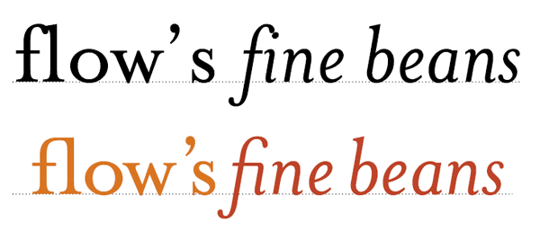
This logotype, shown above, is typed using Mrs. Eaves. See how the ligatures appear too close to each other creating dense areas of type? The gaps between certain letterforms are also unsettling to the eye. This needs to be manually kerned. If the type is set carefully, the ligatures add typographic interest to the words. They add character and begin to tell a story about Flow's shop – it's a classy place with nice coffee too! Careful attention to detail at this stage can help define a logotype and go a long way to help define brand message – all through the simple use of ligatures.
But what about on the web?
Ligatures are in the hands of the fonts and the browsers. As with all web design, there are inconsistencies between the two, so use them wisely. Also, screen readers are bound to have a hard time with ligatures, as will Google. Like a lot of web design, until the technology catches up, we may have to leave them out.
Dashes
The hyphen
The hyphen, or the ‘hyphen-minus’, is what you get when you press the key next to zero on the standard qwerty keyboard – well mine anyway, (for all those pedants out there). It's the shortest of the three types of dashes and is often used incorrectly. I'll look at the most common correct uses of the hyphen first, before moving on to the dashes it is often used, incorrectly, to replace.
There are two types of hyphen: the ‘soft’ hyphen and the ‘hard’ hyphen. Sometimes they are different lengths, but this depends on the typeface.
Hard hyphen
The hard hyphen joins two words together wherever they are positioned on the same line. For example, ‘run-of-the-mill’. It's set closed up, (which means no space either side).
Soft hyphen
The soft hyphen indicates where a word has been split at the end of a line. Arguably, there's very little use for the soft hyphen on the web when the user has so much control over the presentation of the type.
There are many grammatical rules associated with hyphens, which differ greatly from language to language. For British typesetting, and the English language, I'd recommend getting yourself a copy of the Oxford Guide to Style, (the old Hart's Typesetter's Rules).
The en dash
The en dash is one en in length. It's slightly longer than a hyphen and half the width of an em dash. Em and en are typographic measures based on point size. An em is equal to the size of the set type (E.g. 12pt) and an en is half that.
- An en dash is used, closed up, (meaning, without spaces on either side), in–between elements that show a range, e.g, Monday–Sunday, 1985–2005. It is also used when the end element is not known: Joe Bloggs (1984–)*.
- The en dash can be used to show the meaning of to and from, e.g., on–off switch.
- The en dash can also be used to join compound adjectives that include multiple words or hyphens already. In this case the en dash clarifies what is grouped with what, for example, high–priority–high–pressure tasks.
- In Unicode, the en dash is U+2013 (decimal 8211). In HTML, the numeric forms are – and –. The HTML entity is –.
The em dash
The em dash, as its name suggests, is one em in width. The em dash has been neglected by many writers and designers over recent years. Frequently replaced by the hyphen, or that relic from typewriter days, the double hyphen ( — )*, I think it's about time we gave this little fella the time of day. Once again, there are differing grammatical usages depending on the language being used, and the country in which the text is written. In British and North American typesetting there are a few simple rules:
- Use the em dash closed up in written dialogue to indicate an interruption, for example, ‘What a load of—’, but his words were lost on her.
- It can also be used to indicate an interruption in thought within a sentence, when a comma would be too weak to separate the thought from the rest of the sentence, and a period would be too strong. This might happen at the end of a sentence or it can be used either side of an interruption—like this one—and is set closed up.
- In Unicode, the em dash is U+2014 (decimal 8212). In HTML, the numeric forms are — and — . The HTML entity is —.
- It's worth noting that em dash usage is inconsistent, not only across languages, but also across house styles. The most common replacements are an en dash and the hyphen, both set with a space, (or a hair space), either side.
Lists and hanging punctuation
Hanging punctuation, too, has suffered at the hands of certain software products. The term refers to glyph positioning that creates the illusion of a uniform edge of text. It's most commonly used for pull–quotes, but I feel the most neglected use is that of bulleted lists. With the advent of desktop publishing it suddenly became very easy and cost–effective to produce bodies of text. The problem was these bodies of text work within a box. Every character in this box had to be within the box – hanging punctuation requires characters, such as a quotation mark at the beginning of a quote, to be outside of the box. This was a problem for the software and as a result was ignored. An important aspect of typesetting was just swept under the carpet like that. It's a great shame. Things are now improving: Adobe Indesign is offering support for hanging punctuation, and the latest version of Quark may, too. Not sure about Microsoft Word – probably not.
Lists
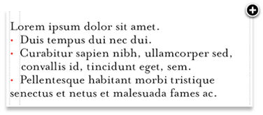
Without hanging bullets
Ranged–left body of type is pretty much destroyed, aesthetically, when punctuation isn't hung. The eye looks for straight lines everywhere, and when type is indented in this way, it destroys the flow of text.
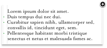
With hanging punctuation, the flow of text on the left side is uninterrupted. The bullets, glyphs or numbers sit in the gutter thus highlighting and unifying the list itself. This representation of a list is more visually sophisticated and more legible.
Pull–quotes
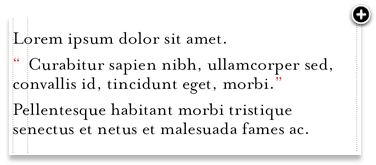
Without hanging punctuation
Nothing is more irritating than badly typeset quotes. The interruption of the flow is considerable and the overall effect is unsightly.
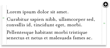
Quotation marks should be ‘hung’ as you see in the diagram above. In this example, the quotation marks are hung either side of the quote. Once again, this allows uninterrupted reading for the audience.
Tables and forms
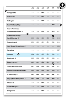
Tables of data and forms should be given careful design consideration. If you forget the usability factors associated with forms on the World Wide Web for just one moment, the actual visual design of tables and forms should be quite simple: Use space well and make sure things line up. Well, it's not always that easy.
I had a baptism of fire with forms and tables. When I was 21, I had a summer internship at an advertising agency in Manchester, UK. In addition to the usual lowly tasks of being the ‘Spraymount Boy’ – yes, for a while there, I virtually lived in the cutting room – I was tasked with helping one of the artworkers, (unfortunately, not my best mate who got me the job, but a rather grumpy little man from Warrington), to help set the tables and forms for a huge plumbing catalogue. This thing was enormous – close to a thousand pages of cutouts, tables and order forms. The grid was set, the type styles were signed off, and it was just left to me and this bloke to fill the pages with thousands upon thousands of little nuts, bolts, thingemies and whatsits. Next to each cutout was a table that referred to the item's specifications, which, in turn, related to an enormous order form in the back of the catalogue. Yes, this was in the days of mail order – way back in 1994.
As tedious as that particular project was, it taught me some valuable lessons for setting tables and forms. Here are some of them:
- Use a thick rule to denote headlines and thin rules to separate lines.
- Don't use alternate background colours in rows, just use one and white.
- If you can, don't use vertical lines. Let the data in the tables indicate the columns.
- To give emphasis to a column heading, set it in CAPS.
- To emphasise a column, set it in bold, or highlight with a different background colour.
- Range numerical data right.
- Give more padding to the bottom of items than to the top. You can still keep the same overall line–height, but this gives the reader a sense of more whitespace.
* It's common practice in North American typesetting to use an em dash for this purpose.
* The usage of this is of course valid on a typewriter where, as with most monospaced fonts, the hyphens, em and en dashes all are similar length.
More from this part
- Chapter 11 – Anatomy
- Chapter 12 – Classification
- Chapter 13 – Hierarchy
- Chapter 14 – Typesetting
- Chapter 15 – Printing the Web
Download the book
Download your FREE copy of Designing for the Web.
