Chapter 23
Grid Systems
A grid is an instrument for ordering graphical elements of text and images.
Before we even begin to tackle designing grid systems we need to have a basic understanding of what they are, why we use them and where they came from.
In the context of graphic design, a grid is an instrument for ordering graphical elements of text and images. The grid is a child of Constructivist art and came into being through the same thought processes that gave rise to that art movement. Clear links can also be drawn between the Concrete–Geometrical art of the Zurich school in the 1930's and several notable artists of this movement made important contributions to typography through their fine art. It was around this period that the grid system moved from the domain of art and into one of typography and commercial design.
First of all when talking about grid systems we have to mentally separate form and function. We have to think about aesthetics and proportions as a result of considered construction. This can be quite tricky for designers who have been schooled in the ‘you'll know it's right when it feels right’ school of composition. But as you read earlier in this part, ‘feeling right’ is an emotional reaction to construction, to mathematics. Ratios and equations are everywhere in grid system design, such as my example from the chapter on the Rule of Thirds. Relational measurements are what define most systems, from simple leaflet design to the complexity of newspaper grids. To design a successful grid system you have to become familiar with these ratios and proportions, from rational, whole–number ratios such as 1:2, 2:3, 3:4 and those irrational proportions based on the construction of circles, such as the Golden Section 1:1.618 or the standard DIN sizes 1:1.4146. These ratios are ubiquitous in modern society, from the buildings around us to patterns in nature. Using these ratios successfully in a grid system can be the deciding factor in whether or not a design, not only functions, but has aesthetic appeal too.
A grid system is a grid design that has been designed in such a way that it can be applied to several different uses without altering its form. An example of this would be a grid system for a book whereby you have many different page types – part–opening, title, half–title etc. – and would need only one grid to use on all the page types. Or a website that has a homepage, a section index, a category index, and an article page. A grid system provides consistency across these pages or sections. The danger with designing a system to cope with many different variants is complexity. When you add complexity, you can decrease usability and there is a danger the grid would become so complex the designer can't use it. This thought should always be running through your head when designing a grid system – keep it simple, but comprehensive, and above all, usable. It is often said of grid systems that they limit the scope for creativity or leave no freedom. Karl Gerstner, one of Switzerland's pre–eminent graphic designers, was aware of this conflict with the designer's adoption of grid systems.
“The typographic grid is a proportional regulator for type– matter, tables, pictures and so on. It is a priority programme for a content as yet unknown. The difficulty lies in finding the balance between maximum formality and maximum freedom, or in other words, the greatest number of constant factors combined with the greatest possible variability.”
The grid is a regulatory system that pre–empts the basic formal decisions in the design process. Its preconditions help in the structuring, division and ordering of content. I'm not saying a well–designed grid will solve all of your compositional problems, far from it, but it goes some way to creating a coherent structure in design that in turn creates the aesthetic values all of us are seeking in our designs.
Constructing a Grid System
The canvas for a grid system is determined by the media size; a book, magazine, signage, or a website. The benefit for designing in more traditional media forms is that your canvas will remain constant. It will not change its shape. Of course on the web, the user can not only view your site in many different browsers, on multiple platforms, but can also resize their browser window to the resolution of their screen. Designing to such variables is a challenge. To successfully design a grid system for the modern web, we have to look at a best–case scenario, and graceful degradation.
In 2006, Jakob Nielsen wrote on his famous Alertbox:
“Optimise web pages for 1024 x 768 pixels”
Then, 60% of all monitors were set at 1024 x 768 pixels. Now, in 2009, that number is down to 30%, with the majority of monitors shipping with higher resolutions. 800 x 600 px resolution is hovering somewhere in the region of 5%. If we use 1024px as the base, that means we will be accommodating over 90% of users. Many of our users will be using higher resolutions, so we have to take that into account also.
The Brief
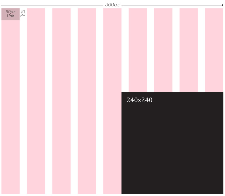
Any grid system design will begin with a brief. With that brief will come constraints. What I look for in a brief is a fixed element from which to derive the grid. That element could be the screen resolution, (as best we can estimate), or it could be something as simple as image sizes. For example, if you were redesigning a site and the site owner had a huge amount of images that he still required in the new site, I'd start by looking at the horizontal size of the images, and seeing if I could subdivide to create by unit size. If the images were 240px wide, you could divide them by 4, to give 60px, then use 10px of that for your gutter, giving you a unit size of 50px. Extrapolating that value out would give you a grid of 16 columns of a 50px unit, with a 10px gutter. The beauty of this approach is that you can be sure that the fixed part of the brief – the constraint – can be accommodated with ease.
Ratios
Ratios are at the core of any well–designed grid system. Sometimes those ratios are rational, such as 1:2 or 2:3, others are irrational such as the 1:1.414, (the proportion of A4 paper). As I discussed earlier in this Part, you can use the Rule of Thirds to create a grid system, or the Golden Section to create more complex grid structures. The challenge is using these ratios in a way that will help you create more balanced, harmonious compositions.
Grid Anatomy
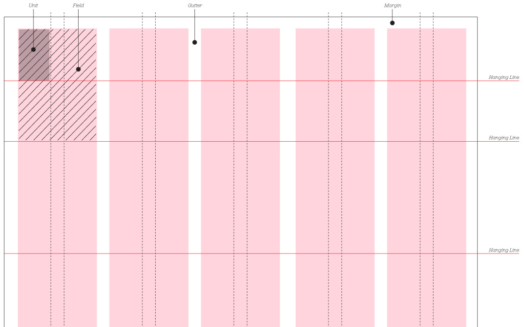
Relational units
At the heart of every grid is the unit. The unit is a base piece from which the rest of the grid is derived. As discussed in the previous example, the unit can be derived from constraints such as the content elements you have to work with, or it can be derived from the maximum screen resolution you are designing to. When designing for books, or other printed material, the unit is normally derived from the typeface size. So, if you are setting 12pt type, the unit of the grid is 12pt, or a multiple of 12. There is a relationship between the layout and the size of the typeface. Em–based, or ‘elastic’ layouts make this possible on the web. If you are setting your type at 1em – the default in most browsers for this is 16px – then your unit size could also be derived from this measurement.
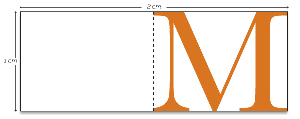
By doing this, you are creating a relationship between your typography, and your layout. They will be tied together. The grid created from the unit will be related to type size. Any layout created on this grid – any element placed within the composition – will be harmoniously connected. And, as the user resizes their text, the composition and layout can be retained. The relationship isn't lost. Creating grids in Photoshop or on paper is one thing, making them work in a browser, across multiple browsers and operating systems is another. To help us achieve this, you can use a CSS framework.
Using CSS Frameworks
CSS frameworks can help make building your grid easier. They can ensure that potentially complex layouts render correctly on, ahem, difficult browsers – yes, I'm looking at you IE 6!
As defined by Wikipedia, a CSS framework is:
“A CSS framework is a library that is meant to allow for easier, more standards–compliant styling of a webpage using the Cascading Style Sheets language. Just like programming and scripting languages, CSS frameworks package a number of ready–made options for designing and outlaying a webpage”
Which all sounds good. The aim of a CSS framework is to take away some of those repetitive tasks, whilst remaining confident your site won't break if you build another layout. There are a number of frameworks you can download, ranging from the complex, (such as the Yahoo! UI Library grid framework), to the simple 960.gs. I'm going to talk about one framework here – Blueprint – and specifically how to use it as a basis for your grid layout.
Blueprint
The theory behind Blueprint started life in the minds of a few great designers and developers at The World Company, a news media company, in the US. Jeff Croft, together with Nathan Borror and Christian Metts devised a CSS framework for the website LJWorld.com. Jeff wrote an article about it on A List Apart, and Olav Bjorkoy made the theory real, and Blueprint was born.
Blueprint does the following things:
- Resets standard browser behaviour.
- Applies a sensible typographic stylesheet.
- Provides a flexible grid stylesheet.
- Has a basic, but serviceable, print stylesheet.
- Is tested, and works in, IE 6.
All of these styles can be overridden of course. Specifically, it's important to point out that the grid.css can be customised by way of the extremely handy Grid Generator.
Grid generator:
http://kematzy.com/blueprint-generator/
This allows you to break out of the cookie–cutter approach of the 950px grid. Not every site we design will start from this base measurement or the web would look like a very boring place. Make sure you design your grid first, and then use this generator to create the Blueprint grid.css file for you. Blueprint ships with a plugin architecture. To add elements, such as icons or tabs, simply create a new stylesheet in the plugin directory to hook in your new styles. Blueprint is a large framework, and has been criticised for making you add non–semantic class names in your HTML, like ‘span–8’. The main point of criticism is that these are presentational class names, indicating how a column in a grid will look. Good web standards HTML requires you to add class names with semantic value, like ‘navigation’, ‘content’, or ‘sub–content’. Well, you can add semantic value to a Blueprint layout by including them as well.
For example:
<div class="navigation span-24">
Your navigation
</div>
Alternatively, you can add the semantic value to the ID of the div.
<div id="navigation" class="span-24">
Your navigation
</div>
Using Blueprint, you will end up with more HTML markup in your document. You will have more divs, with more class names and IDs. If you can live with that, and if Blueprint helps you create great, flexible layouts, then I think that's fine.
Drupal.org – a redesign process using Blueprint
I've seen great value in Blueprint when using it for rapid prototyping. Specifically, Mark Boulton Design, the small design studio I run, used Blueprint to build the prototypes for the redesign of Drupal.org. The process for the redesign of Drupal.org was a twelve week exercise. We released weekly prototype designs based on information architecture, user testing and feedback, community feedback, and revised business goals. With such tight timeframes, we needed to focus on the user experience and design of the site, rather than worrying about fixing IE 6 bugs. We needed a CSS framework.
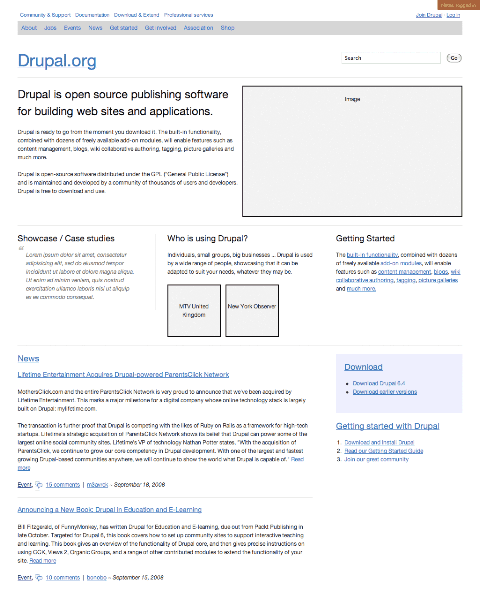
We started out using Blueprint to create quick lo fi HTML prototypes. These were essentially wireframes created using the various classes and styles available with Blueprint. As time went on, we needed to create more and more plugins for Blueprint for things like tabs, buttons, tables etc. When the prototype reached a certain point – iteration 6 – we needed to start applying a visual design to the completed wireframes. This is where Blueprint came into its own. With minimal changes to the HTML documents, we were able to add a Drupal.css stylesheet to override a lot of the default styles and start to apply a Drupal design. Through the iterative process, we were able to build upon this to produce quite different looking designs from release to release. All the while, the Blueprint core css files remained the same. That way, we could ensure that if we needed to upgrade Blueprint for whatever reason, we'd be able to do so without breaking the site.
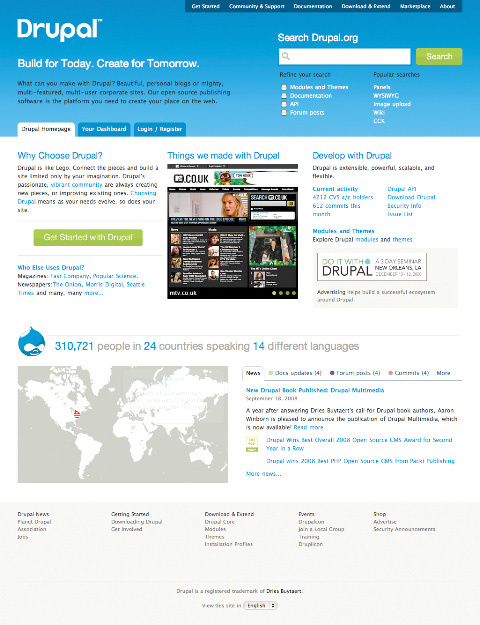
The final version of the redesigned Drupal.org, in all likelihood, will not use Blueprint as its CSS framework. Whilst the various templates look great, the HTML in the background is bloated, and could be dramatically improved. If you plan on using Blueprint for a production environment, or on a live site, make sure that you pay particular attention to this. Make sure you keep your HTML nice and trim.
More from this part
- Chapter 21 – The Basics of composition
- Chapter 22 – Designing for the web
- Chapter 23 – Grid Systems
- Chapter 24 – Breaking the grid
- Chapter 25 – Bringing it all together
Download the book
Download your FREE copy of Designing for the Web.