Chapter 25
Bringing it all together: De Standaard
Case study for De Standaard.
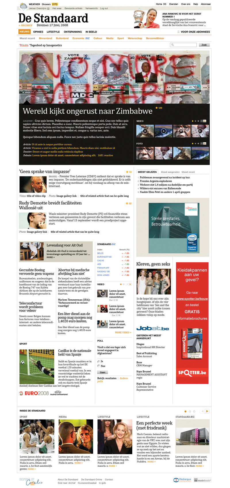
In June 2008, a team from De Standaard – www.standaard.be – approached my design studio with a request to see if we'd be interested in redesigning their website.
De Standaard is a Flemish daily newspaper published in Belgium with a circulation of over 100,000. It is a high quality newspaper with an interesting history spanning eighty years – through Nazi occupation of Belgium, to political unrest, through to bankruptcy. This case study is somewhat of an exclusive for this book at the time of publication. The new De Standaard site was relaunched in Q1 2009.
The Brief
The first meeting took place in the National Portrait Gallery in London on a nice sunny day. Immediately I was struck by the lofty goals of the redesign of the website. The New York Times website, together with The Times in the UK, and The Guardian, were all mentioned as the benchmark that needed to be set for the design. The bar was indeed set high. It was important, during that initial briefing session, that I understood the motivations behind the need to redesign.
They can be summarised as:
- Improve the core content
- Improve the brand and appeal to the users of the website, not the readers of the paper
- Improve the innovation of the new site
- Improve the business model (better ad positioning, sell subscriptions, cross promotion)
- Outdated look and feel.
- Integration of new content management system.
As you can see, the breadth of the design problem was considerable. From the business strategy and revenue models, all the way up to the typography and brand perception. All of it had to be considered, rationalised, researched, and designed.
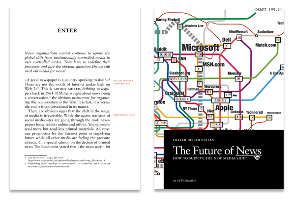
Should a newspaper online look offline? During the research and discovery phase of the project, I kept asking myself the same questions regarding newspapers online. Do they need to look like their offline siblings? Should I try to be emulating some of the conventions used in the physical newspaper? It's an important consideration, and something I'm not alone in contemplating. Information Architects, (iA), the small design studio in Japan, wrote a seminal document called ‘The Future of News’, where they highlighted the risks and opportunities for newspaper companies in the coming years to take advantage of the web. Many of these were relevant for this project.
iA highlighted the following of threats to not migrating to the web:
-
‘Lower reading experience.’
Printed newspapers are easy to read. On the train, the underground, on the way to work. The web isn't.
-
‘Losing journalistic quality.’
-
‘Severing cultural roots.’
The printed word has a rich, important heritage.
However, the opportunities, in my mind, far outweigh the threats.
-
‘Optimised reading experience.’
Given the immediacy of news content, having relevant supportive content – in the form of text, image, video and multimedia – enriches the reading experience.
-
‘Improved democracy.’
The user can have their say. And, in a ‘web 2’ world, that is actively encouraged. It was a key component of De Standaard redesign that the user engagement was an integral part of any redesign, not just an add–on.
-
‘Historic development.’
Newspapers will eventually migrate to the web, and printed newspapers will be a luxury. We're already seeing this with a steady decline in newspaper circulation.
These threats and opportunities underpin the design strategy for the new site. How could I lower the risks, and exploit the opportunities in the design system we produced?
The Constraints
All projects have constraints. Without them, designing would be incredibly difficult. However frustrating they can be, they are our boundaries; a framework in which to work. And typically, De Standaard had plenty of them.
Existing content
www.standaard.be had been around for years. During that time, there had been attempts to enforce standards; from ads to image sizes. It was our job to audit as much of that content as possible, and then to define new standards that fit the patterns and trends.
Brand integration
As I mentioned, De Standaard is a newspaper with a rich history. The readership however, is typical of a once–broadsheet newspaper; older, male, white–collar. The website, however, has a slightly different audience. Still predominantly male, they are younger, less conservative in their political views, and regular consumers of the web. In that sense, the two brands are related but not the same. This subtle difference had to be accounted for in the design.
Revenue
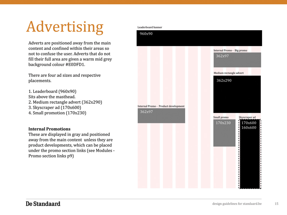
Like most newspapers, De Standaard relies on advertising and subscriptions for its revenue. Previously, www.standaard.be used some standard ad sizes, and some bespoke ads for running internal promotions and competitions. With so many different sizes, some standardised, and some not, any changes to design and global layout were challenging. Ads were shoe–horned in where they would fit, rather than strategic positioning.
Modular Content, Modular Grid
Newspapers, like most text–based material, are comprised of typographic elements. During the initial discovery and research phase, we conducted a number of audits on the content elements on the site.
Content objects
We were provided with a list of content object requirements as part of the project brief. These ranged from simple article lists, and teasers, to more complex video players and tv listings.
Typographic elements
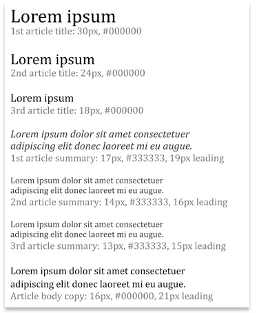
All written content can be structured into typographic elements; such as paragraphs, lists, headings, captions, blockquotes etc. Newspapers cover such broad stories, so from an editorial standpoint, the writers need all of the typographic elements they are used to working with. Any audit of content objects, should also incorporate an audit of the typographic elements required for the hugely varying content.
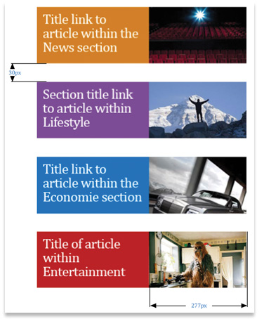
Lead article variations
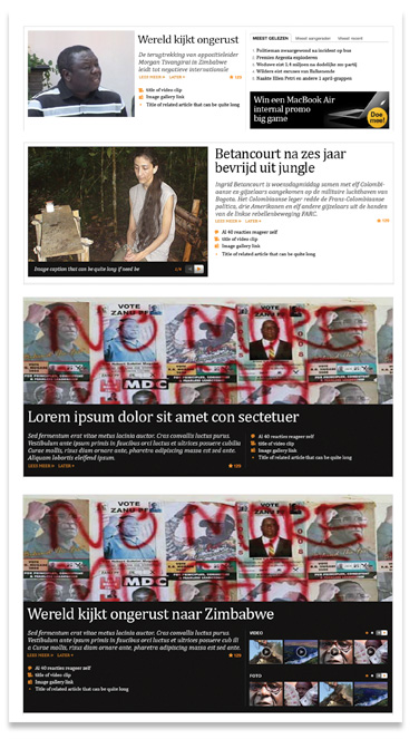
To cope with the variety of importance of lead news story items, a number of variations were explored and designed. It was also important we explored how stories can escalate. A news story can start small – breaking news – with small amounts of information and associated content such as photos and video. Over time, the story gathers more pace, more content, more exposure, and more importance. All of this has to be structured into a content object that allows the display of that flux. We designed several versions ranging from a simple lead story, right up to the extra large version.
Several different sections with different audiences
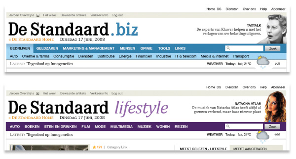
Like most newspapers, De Standaard has daily and weekly supplements – ranging from the popular ‘Economie’ business supplement, to the ‘Lifestyle’ magazine. The various sections not only needed to be accommodated in the new site, but they also had to appeal to the different audiences. Economie, for example, required a flexible design to incorporate the various graphs and stock information, together with the usual editorial content. Lifestyle required a brighter, more approachable, look. Large photographs, multimedia galleries etc. were the order of the day. Both Lifestyle and ‘.biz’ use a slightly different masthead and logo, and different colour palettes. This reinforces the sub-brands but also the provides orientation for the user.
Designing the Grid
The constants define the columns. De Standaard uses standard advertising units as defined by Interactive Advertising Bureau. For the new site, it was proposed the following ad units would be incorporated:
- 300 x 250 IMU – (Medium Rectangle)
- 728 x 90 IMU – (Leaderboard)
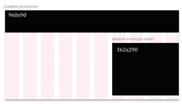
These ad units are relatively common for commercial sites, but particularly common for the newspapers. The New York Times, Guardian, and Times Online, (the three sites indicated as a benchmark for the redesign of De Standaard), all carried the Medium Rectangle, and all but the New York Times uses a Leaderboard. In addition to these standard ad sizes, we also had to contend with existing image sizes employed by De Standaard for several years. All of this legacy content had to be included in the new design without breaking the layout. These elements are constants. The size of these elements are fixed, and will not change over time so they are a safe starting point for us to design the grid around.
Asymmetrical columns
A lot of grids on the web are based on even numbers of grids: 12, 16, 24. On researching this project – especially by reading a huge variety of newspapers from around Europe – it became clear that actually in physical newspapers, an odd number of columns is the norm: either 5, 7, or rarely 9 columns. I believe this creates an imbalance, and therefore an opportunity to create tension in a layout. Let me explain a little. An even number of columns is a little like using a square for composition. It's stable, balanced, and even. Using a square as a compositional base can result in a balanced layout, but the danger is the resulting design will have no movement. It's more difficult to lead the eye around a layout that has a strong symmetrical base. Think back to earlier in this part where I discussed the advantages of using a triangle as a primary compositional device.
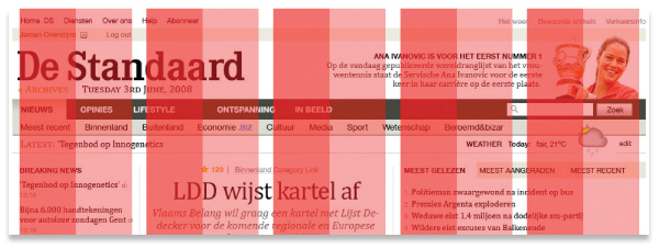
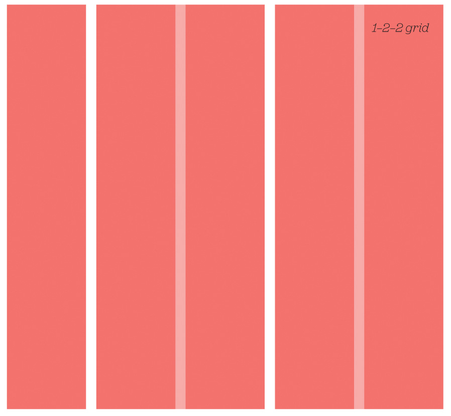
For this reason, I opted for a five–column master for the new De Standaard grid. These columns would each be separated by a generous gutter.
These master columns then can be subdivided to give ten columns to provide more layout flexibility. The master columns of this grid allow for a number of permutations, shown opposite. Particularly on the initial homepage design, the five column layout allows for uneven, interesting layouts.
Design Exploration
Once I'd worked through the initial wireframes, and functional requirements for the various templates on the new site, I got down to some design exploration. We adopted an iterative approach to the design development. In total, there were more than ten rounds completed before we delivered the final design framework. Here's a walkthrough of the major design milestones:
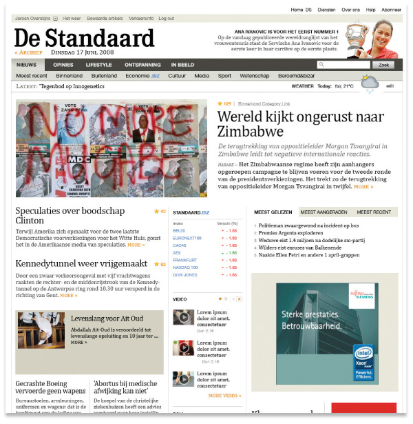
The initial design direction set the typographic and colourway tone. Predominantly black and white, with a spot colour of orange.
Iteration 1:
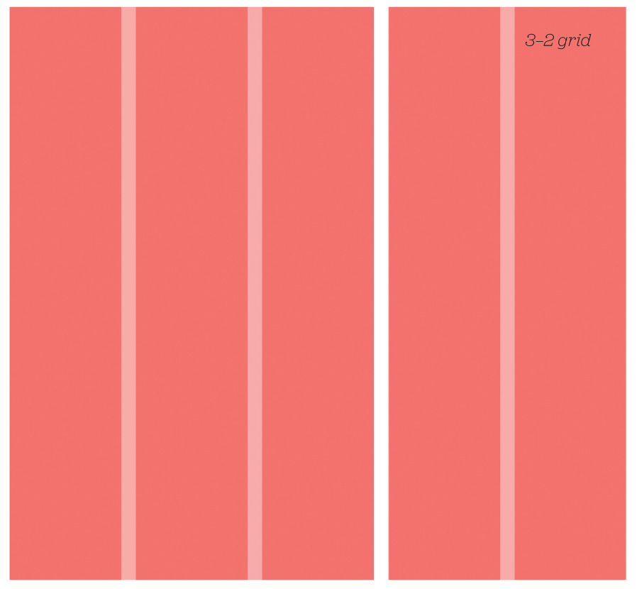
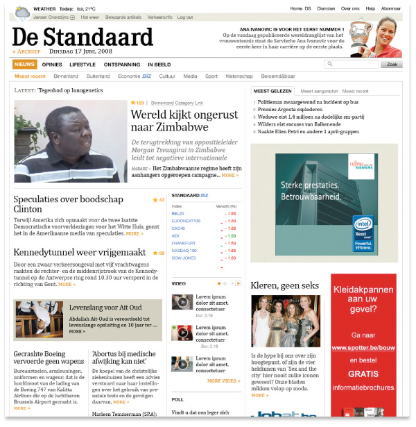
A more conventional layout was adopted for the second iteration, with a column configuration of 3–2. This version included a completely revised masthead and main navigation bar. The previous version was too dark and visually heavy. The aim was to draw users beyond the masthead and into the content below. The previous version was acting as a visual barrier.
Iteration 2:
More subtle revisions to the masthead. Incorporating orange colour into the links creates a strong horizontal line of links. No need for a background tone to tie all of that together.
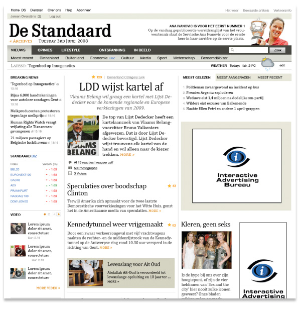
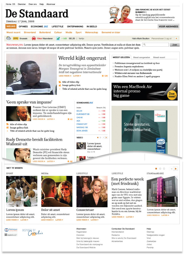
Iteration 3:
The final design as applied to the homepage and subsequent pages throughout the site. The flexibility of the grid helped create a coherence between sections. Shown here are the section for the TV guide.
Design a system, not a website
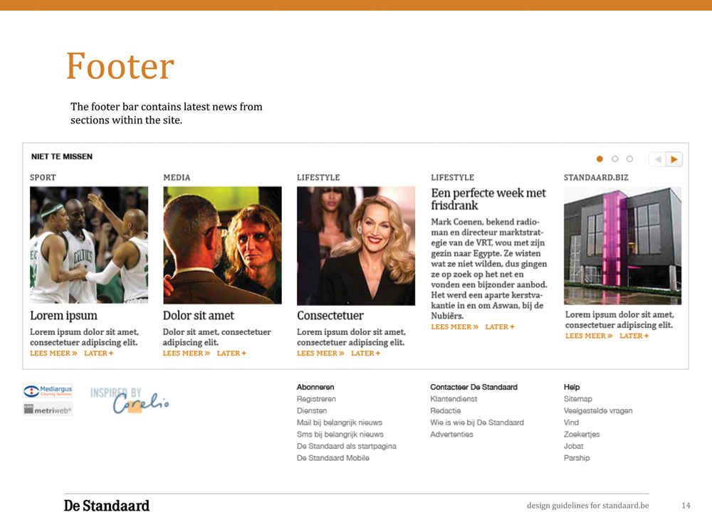
This project had limited budget, and limited time. We didn't have the luxury of working in–house, or crafting a user experience for every single user journey on the new site. How do you approach a project of this scale, with limited resources and time? By designing a system, and not a website. As highlighted in this chapter, we approached this project as designing a kit of parts – as a framework. A skeleton of a grid system, with modular content objects that could be placed in the grid, in various configurations, to create the site. If that approach is combined with a sensible colour palette, opportunities for art direction, and sensitive typography, as a designer, you are arming the editorial teams with all the tools they need to create a site from new and old content without designing individual pages. We delivered the various bits and pieces together with a visual language document.
The visual language guide documents how the site can be built out in the future. From the various colourways for each section, through to how the various content objects work in the grid. It's important to note that this document is by no means a comprehensive guide to cover every eventuality. Those types of guideline–design documents generally fail. Many designers do not like to work within strict constraints. Instead, we proposed this document to be a starting point. It touches on all the different elements of the visual language, but provides enough scope for creative movement for the various editors and designers who will be working on the site. Providing this framework allows people to be creative in the future, and by doing so, they should feel a degree of ownership. The visual language will begin to represent the ongoing content on the site, not describing a designer's vision. That is a subtle but important distinction.
The principles of layout – from composition theories to grid systems – largely do not rely on the medium of the design's delivery; most of the layout theories I've discussed are derived from either print design or photography. There's a good reason why they shouldn't be discounted. In ‘Getting Started’, I highlighted that early in the development of web design, many designers practicing web design were print designers. They used established conventions and graphic design practice to create web sites. This wasn't a bad thing – it was all they knew – but over the past ten years the words ‘print’ and ‘web’ are often met with grimaces from web designers working in the industry now. The old ‘the web is not print’ argument raises its head every now and then, and we cover the same ground, and reach the same conclusions. The result is that web designers are not learning applicable graphic design craft. There is still much we can learn from the practice of graphic design and layout is just one.
More from this part
- Chapter 21 – The Basics of composition
- Chapter 22 – Designing for the web
- Chapter 23 – Grid Systems
- Chapter 24 – Breaking the grid
- Chapter 25 – Bringing it all together
Download the book
Download your FREE copy of Designing for the Web.